Project 5

|
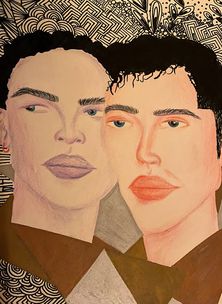
TITLE: Liberty and Freedom
MEDIUM: Colored pencil and sharpie on paper DIMENSIONS: 14 x 17 cm DATE COMPLETED: December 2019 |
Exhibition Text
Through the inspiration of Joseph John Bertrund Belanger's ""Two Young Men Kissing in a Photo Booth in 1953”, I was able to create an illustration using colored pencil and sharpie. The piece symbolizes a unique milestone in the LGBTQ communities rights. The piece is important because it gives recognition to one of the first photographed same sex couples during times where it wasn't openly accepted, especially during the 50s.
Inspiration

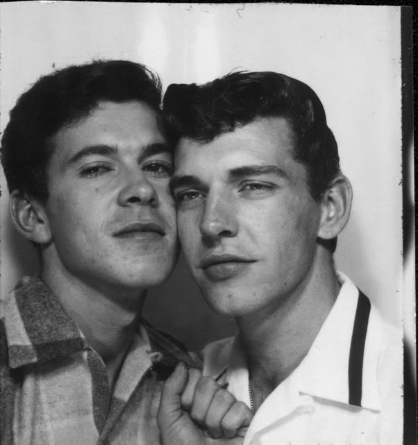
Joseph John Bertrund Belanger (right) shares a tender moment with a man in a photo booth. “PGE exhibition, Hastings Park.” Vancouver, Circa 1953. Photo: ONE National Gay & Lesbian Archives at USC Libraries.
|
The name of this photograph is “Two Young Men Kissing in a Photo Booth in 1953”. This was taken in America during the 50s which was not a very accepting time for same-sex couples, and it was very dangerous for individuals who weren’t straight, white, mostly male, and of the middle class. These harsh times for people that were just different were hard and scary. Now, times are becoming more progressive, and aware of those that are different. However, during the time of this photograph, the two men were confined to the secret they left behind the curtain in the photo booth, only to step out with their false identity in order to preserve a normal life in the 50s trying times. The photo is property of Joseph John Bertrund Belanger, a man born in Edmonton, Canada in 1925, and was part of the Royal Canadian Air Force from 1942 to 1944. He moved to California in his early 20s after the Air Force and was part of one of the first LGBTQ+ organizations called the Mattachine Society. Since this was an unacceptable act in the eyes of a 50s society, the photograph is very valuable because of the juxtaposition of the circumstances during those times. I was inspired by this because it is one of the first photos of two lovers during a forbidden time of love for those of the same sex. I decided to honor these two men by doing my own rendition of the photo through an illustration.
|
Process and Planning
|
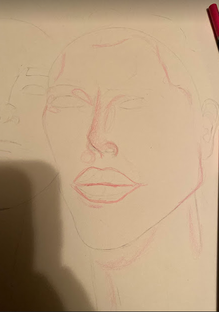
Since the guys in the photo are in different positions but still facing the camera, this illustration was easier than an illustration would be with a different perspective or angle. When I am beginning a drawing or illustration, I like to draw shapes in the head, and outline the hair. Then, I usually divide the face into four sections, a line down the middle of the face, and a line across where the eyes would be positioned. From there, I then place a line where the bridge of the nose would be, and then another line where the mouth would be positioned. From those lines I then draw the facial features, and make sure they look okay. Then, once I have positioned and sized the features to my liking on the face, I take the pencil and finalize the lines, slightly darker than the ones I drew for sketches.
|
|
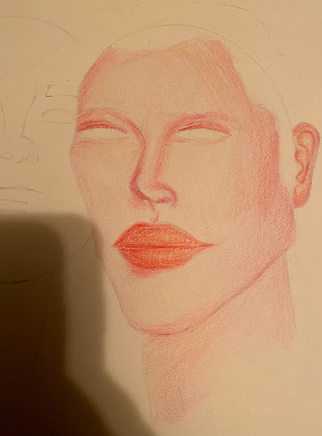
The picture to the right is the harsh finalized lines I drew for the portrait after I erased them. Erasing the dark lines created an outline of where I was supposed to draw so that it acts as a guide or a line telling me where to stop, and where the facial features are so that I won't have any pencil marks. Doing this allows me to still be guided and know where I am going when illustrating the face and its structure. I also like using this technique because it doesn't leave graphite marks when I go over it in colored pencil. This way it is clean and blended properly, not sloppily. I always try and begin with the lightest shade as a base, and slowly contour and highlight the places where the shadow and light hits on the portrait. I always begin with shadows and use the darker shades (of blues in this case) towards the outer part of the case, and the lighter shades working towards the inner part of the face, which is easier when trying to blend it in with the entire face. This doesn't create too harsh lines and makes the shadows blend into the base color of the skin in the portrait.
|
|
Experimentation
|
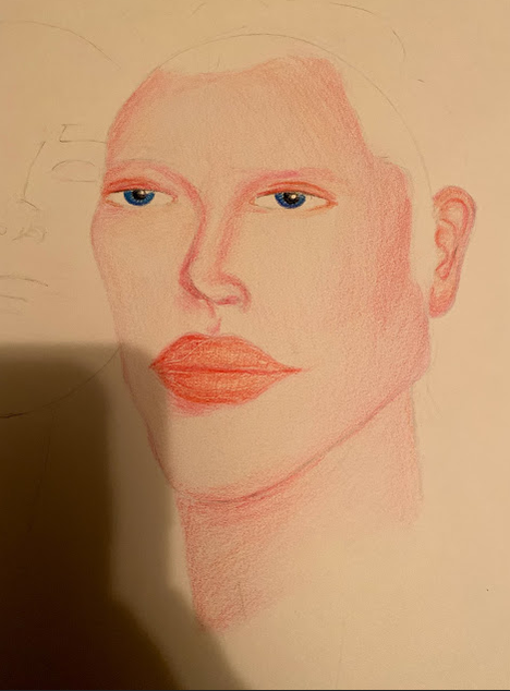
Usually I begin with the shadows when drawing them, starting around the cheekbones on the face, and then around the eyes. Just like when you are applying contour for makeup, you do the same with illustration in order to add depth to the structure of the person's features. There should be shadows and contours in the shape of what would be a backwards three on the face, depending on where the light hits the face and what angle or position the person's head is in. Because the man's face was at almost a side profile, looking towards the right, I had to position certain shadows accordingly. I wanted the light on his face to be hitting against the right side of his face, so I shaded in the baby pink and almost rose pink color to define his cheekbones and around the bridge and nostril of his nose. I also use the darker shades of the red in order to shade around his eyes so that his eye shape would be more dramatic and defined. I tried various techniques when shading, and found that the best was to work in circular motions and then to blend out the darker shades with my lightest shade of red, which was almost a baby pink or rose pink. This allowed for it to come out evenly rather than harsh on the paper. |
|
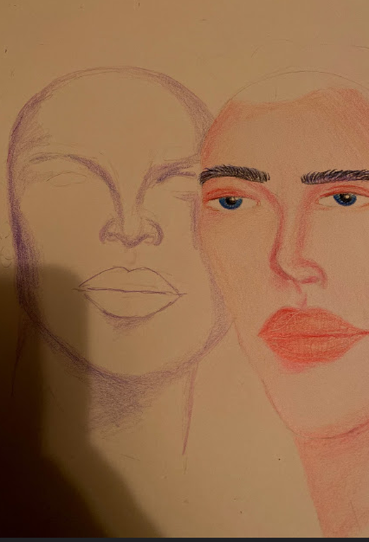
I don't particularly like drawing or painting hair because it is a very tedious and demanding process, which as an impatient artist, I have never been good at. So for this reason, you will often find many of my artworks have solid hair colors if they are portraits or drawings of people. Often when doing art pieces I have to finish it quickly or when I am in that particular mood because it is hard to paint when I am not in my 'zone' or feeling that same emotion. I think emotion carries a lot of weight when influencing artworks and that your emotion can affect how others perceive and 'read' that work, therefore it's important to execute it with the emotion you want to be evoked to others when looking at the piece. Anyways, when drawing hair, I like to do solid colors in order for me to put more emphasis on the face and its features and the expression the individual is making within the piece. I actually drew the hair in sharpie, and used short strokes when drawing it in because my sharpie was running out of ink. I thought this wouldn't show up very nice, so I was prepared to go over it once more to get it a true jet black with no stroke marks from the sharpie. However, I actually liked the sort of pattern it made with the hair, it made the hair seem as if it was wavy because of the small overlapping between strokes, which can be seen in the final picture of the illustration.
|
|
|
When doing zentangle designs, I find it is important to escape from reality for a small amount of time, listen to some music and let the tool do the work for you. Not only is this a good mental escape, but it helps me create some of my best patterns and designs in my zentangle. Breaking up some of the harsh lines and incorporating some empty space is just as important in making sure your background is both balanced and detailed. I don’t want the viewer to feel lost, or as if the background is too much, so I try and break it up with some metallic colors like copper, gold, and silver. This adds variety and a pop of shiny color to each piece, making sure it does not have the busy effect, but the detailed effect.
|
Reflection
I would probably work on the shading and blending just because I don’t like how it turned out with some of the line work looking cheap and sloppy. It is hard to blend with colored pencil on such a large surface without it taking forever. As an artist in order to produce the very best I have to learn patience and tailoring my working periods. I would also change some of the proportions on the portrait. I do like to draw large eyes much like the artist Margaret Keane, however, I should work on realistic proportions to better my craft. This would help me in my future works to be more successful. As far as the zentangle goes, I am proud of the work in the background. I would add some more variety since I think I repeated some of the square and circular shapes too much, however I am pleased with the overall outcome.
Joseph John Bertrund Belanger (right) shares a tender moment with a man in a photo booth. “PGE exhibition, Hastings Park.” Vancouver, Circa 1953. Photo: ONE National Gay & Lesbian Archives at USC Libraries.
|
Similarities
Differences
|

|
