Project 4
|
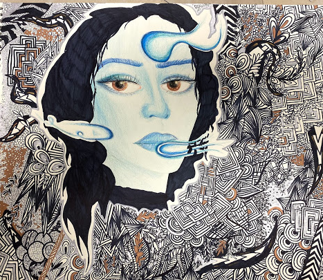
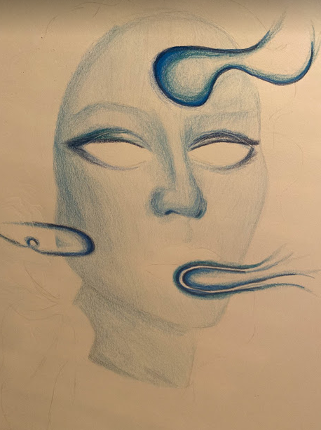
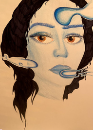
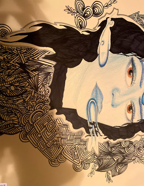
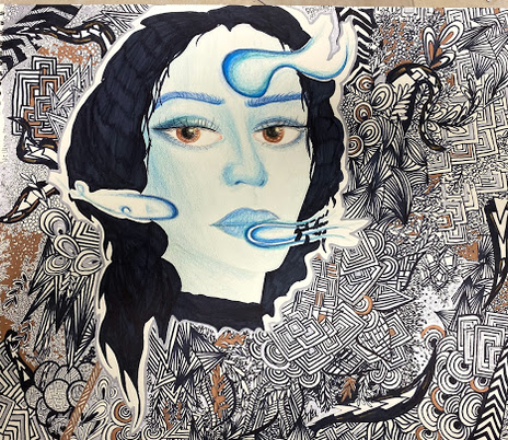
TITLE: Distortion and Reality MEDIUM: Colored pencil and sharpie on paper DIMENSIONS: 14 x 17 cm DATE COMPLETED: November 2019 |
Exhibition Text
Through the inspiration of Charity Henderson's "Covert", I was able to create an illustration using colored pencil and sharpie. The piece symbolizes emotional suppression and identity. Many individuals, specifically women experience sexism every day, and experience emotional suppression, concealment, and change of identity. The zentangle represents the creative mindset and input women have, and the shades of blue symbolize the emotional struggles such as depression because of the affects of sexism.
Inspiration

Covert. Mixed media on mylar. 16" x 12." 2017.
|
Charity Henderson is a figurative artist who earned her BFA in SUNY Brockport in 2010 and her MFA at UMass Dartmouth. She uses various mediums such as charcoal, graphite, colored pencil, oil paint and more. Henderson usually creates portraits of individuals in which she aims to illustrate emotional suppression, belief, identity and the psychological intricacies of the human facial structure. She uses both mylar and duralar in order to get the translucent effect in her pieces, which she says 'mirrors in technique the thematic questions my work explores' (Henderson, 2016). In the world, specifically for females, there is often a sense of emotional suppression in the workplace, a concealment of your true identity in order to be taken seriously and held to a high degree. As a woman, I have often experienced myself changing my reactions and emotional response during certain situations in order to be considered equal to my male coworkers. Classic sexism exists in every job or work environment, and it is quite irritating, putting on a mask in order to be promoted or offered the same opportunities. Some men are never judged on their clothes, and their coworkers don't comment on their outfits with hidden jokes and jabs. Some men over explain or 'mansplain' topics to their female coworkers, even going as far to restate an idea by their female coworker and receive credit or be heard by the male constituents. Females often feel that they have to suppress emotions and mold their behaviors and facial expressions in order to be respected in a sexist work environment. This is just one example of how women can relate to Charity Henderson's artwork, and why I created an illustration inspired by her piece.
|
Planning and Process
|
|
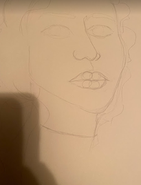
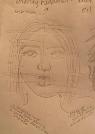
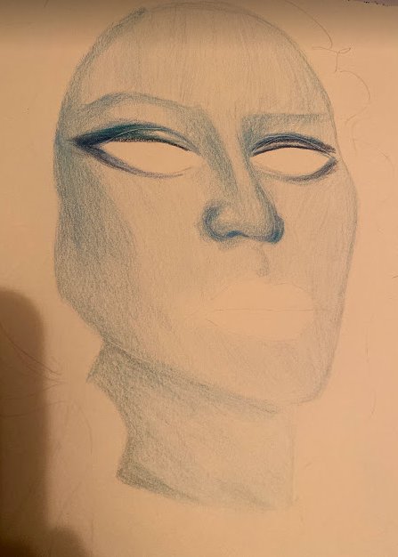
I initially wanted to do a portrait style, face on illustration (like the picture to the right) much like Charity Henderson's work. However, I am quite used to doing face on portraits, and I wanted to challenge myself by doing a different pose, changing the angle or position of the face and drawing the features accordingly. This was difficult, especially because I am not accustomed to drawing in this perspective, and features need to be placed correctly on the face in order to look 'normal', features like the nose and right eye need to be angled and position because her head is turned. When I am beginning a drawing or illustration, I like to draw shapes in the head, and outline the hair. Then, I usually divide the face into four sections, a line down the middle of the face, and a line across where the eyes would be positioned. From there, I then place a line where the bridge of the nose would be, and then another line where the mouth would be positioned. From those lines I then draw the facial features, and make sure they look okay. Then, once I have positioned and sized the features to my liking on the face, I take the pencil and finalize the lines, slightly darker than the ones I drew for sketches.
|
|
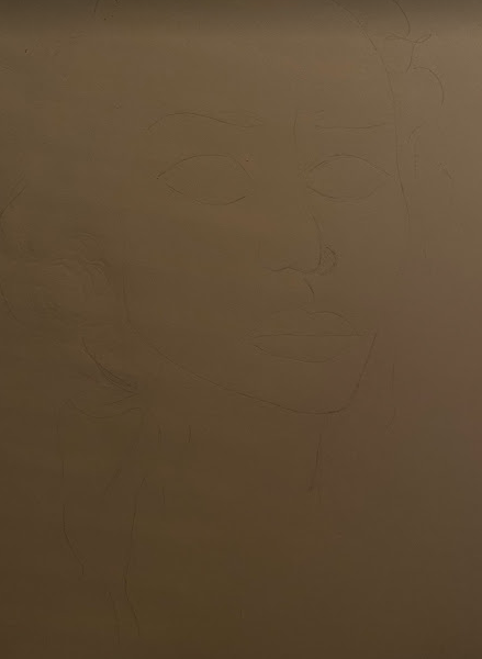
The picture to the left is the harsh finalized lines I drew for the portrait after I erased them. Erasing the dark lines created an outline of where I was supposed to draw so that it acts as a guide or a line telling me where to stop, and where the facial features are so that I won't have any pencil marks. Doing this allows me to still be guided and know where I am going when illustrating the face and its structure. I also like using this technique because it doesn't leave graphite marks when I go over it in colored pencil. This way it is clean and blended properly, not sloppily. I always try and begin with the lightest shade as a base, and slowly contour and highlight the places where the shadow and light hits on the portrait. I always begin with shadows and use the darker shades (of blues in this case) towards the outer part of the case, and the lighter shades working towards the inner part of the face, which is easier when trying to blend it in with the entire face. This doesn't create too harsh of lines and makes the shadows blend into the base color of the skin in the portrait.
Experimentation
|
|
|
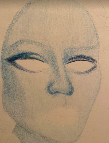
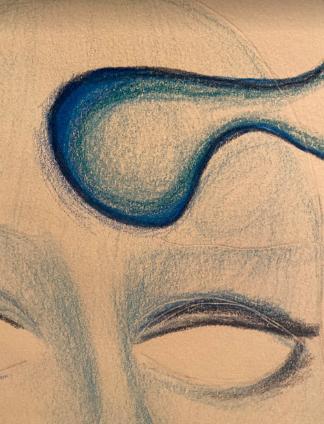
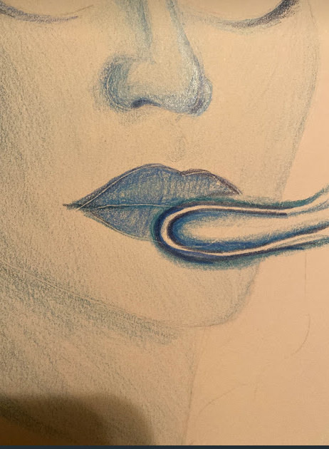
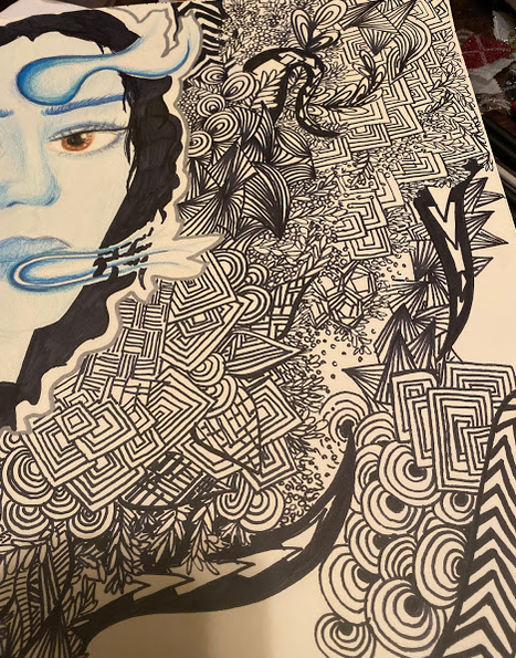
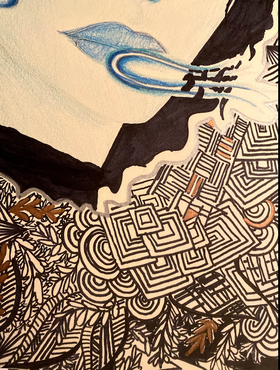
Usually I begin with the shadows when drawing them, starting around the cheekbones on the face, and then around the eyes. Just like when you are applying contour for makeup, you do the same with illustration in order to add depth to the structure of the person's features. There should be shadows and contours in the shape of what would be a backwards three on the face, depending on where the light hits the face and what angle or position the person's head is in. Because the woman's face was at almost a side profile, looking towards the right, I had to position certain shadows accordingly. I wanted the light on her face to be hitting against the right side of her face, so I shaded in the navy blue and almost ocean blue color to define her cheekbones and around the bridge and nostril of her nose. I also use the darker shades of the navy and ocean blue in order to shade around her eyes so that her eye shape would be more dramatic and defined. I tried various techniques when shading, and found that the best was to work in circular motions and then to blend out the darker shades with my lightest shade of blue, which was almost a baby or sky blue. This allowed for it to come out evenly rather than harsh on the paper. Since I wanted to do something a little different than Henderson and add my own person artistic element to the piece, I decided to do what some may say looks like smoke or wavy lines cutting into her face. This is similar to the distorted element Henderson added to her pieces, but still keeps the features clear and precise as opposed to blurry and disfigured. The best way I could achieve this was to outline the curving inorganic lines was to first outline them in the darkest navy blue and slowly have them feather out in shade and color to my lightest sky or baby blue. Then each layer would have a gradation leading to the lightest shade in order to make the 'smoke' or line work stand out more. I find that the top swirl (second picture) is executed better than those in the bottom, mainly because I used that specific technique in the circular shape on the inside of the swirl to make it more defined and 3-d.
|
|
|
|
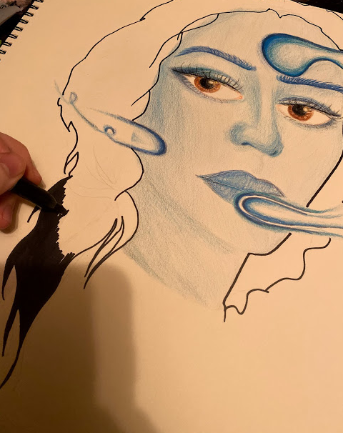
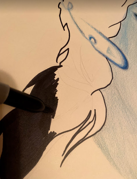
I have always disliked drawing and doing illustrations and paintings with hair. I don't particularly like drawing or painting hair because it is a very tedious and demanding process, which as an impatient artist, I have never been good at. So for this reason, you will often find many of my artworks have solid hair colors if they are portraits or drawings of people. Often when doing art pieces I have to finish it quickly or when I am in that particular mood because it is hard to paint when I am not in my 'zone' or feeling that same emotion. I think emotion carries a lot of weight when influencing artworks and that your emotion can affect how others perceive and 'read' that work, therefore it's important to execute it with the emotion you want to be evoked to others when looking at the piece. Anyways, when drawing hair, I like to do solid colors in order for me to put more emphasis on the face and its features and the expression the individual is making within the piece. I actually drew the hair in sharpie, and used short strokes when drawing it in because my sharpie was running out of ink. I thought this wouldn't show up very nice, so I was prepared to go over it once more to get it a true jet black with no stroke marks from the sharpie. However, I actually liked the sort of pattern it made with the hair, it made the hair seem as if it was wavy because of the small overlapping between strokes, which can be seen in the final picture of the illustration.
|
|
|
Usually when doing zentangle designs, I find it is important to escape from reality for a small amount of time, listen to some music and let the tool do the work for you. Not only is this a good mental escape, but it helps me create some of my best patterns and designs in my zentangle. Breaking up some of the harsh lines and incorporating some empty space is just as important in making sure your background is both balanced and detailed. I don’t want the viewer to feel lost, or as if the background is too much, so I try and break it up with some metallic colors like copper, gold, and silver. This adds variety and a pop of shiny color to each piece, making sure it does not have the busy effect, but the detailed effect.
Compare and Contrast
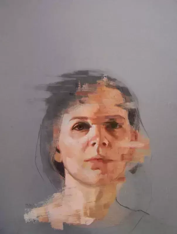
Covert. Mixed media on mylar. 16" x 12." 2017.
|
Similarities
Differences
|
|
Reflection
|
|
Overall I am happy with the outcome of the piece, although I would change some things. I would probably work on the shading and blending just because I don’t like how it turned out with some of the line work looking cheap and sloppy. It is hard to blend with colored pencil on such a large surface without it taking forever. As an artist in order to produce the very best I have to learn patience and tailoring my working periods. I would also change some of the proportions on the portrait. I do like to draw large eyes much like the artist Margaret Keane, however, I should work on realistic proportions to better my craft. This would help me in my future works to be more successful. As far as the zentangle goes, I am proud of the work in the background. I would add some more variety since I think I repeated some of the square and circular shapes too much, however I am pleased with the overall outcome.
|
