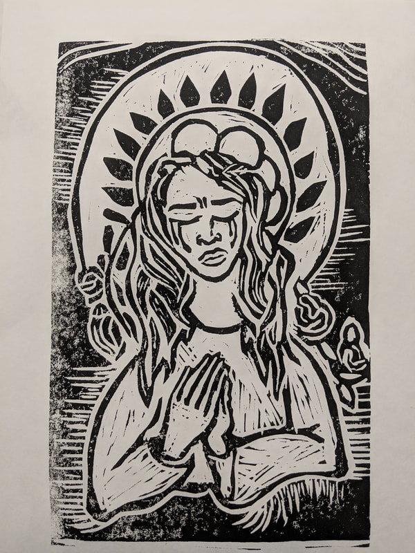
Block Print

|
Title : Beauty and Sorrow
Size : 17cm x 25cm Medium : Block Print, Ink on paper Date : January 2019 |
Exhibition Text
This piece was inspired by Alphonse Mucha's "F. Champenois" and Cristobal de Villapando's "Immaculate Conception" to represent the portrayal of women through religion and the unrealistic value they hold within the the art nouveau movement within this block print piece. This can be related to the modern world today, as women still face inequality in America.
Inspiration
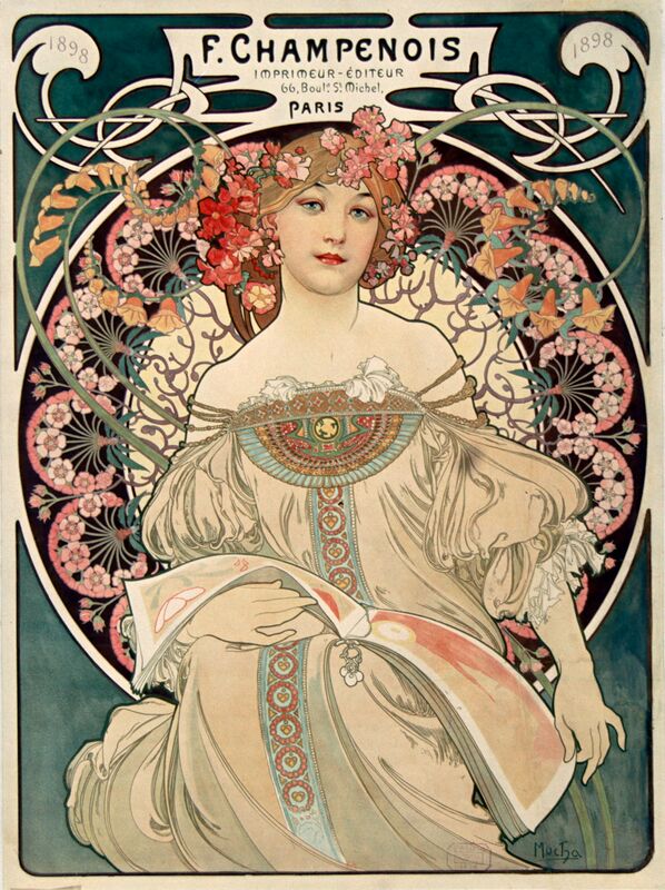
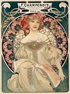
Alphonse Mucha
Daydream/Reverie (1896) |

Cristobal de Villalpando
Immaculate conception (1680-90) |
|
For my first inspirational piece, I decided to use Alphonse Mucha's "Daydream/Reverie" to incorporate into the style of the block print. I wanted to show how women are portrayed according to religion as these very 'fragile' and 'fertile' beings. I used the art nouveau movement in order to critique on Mucha's representation of females. In his pieces, he often paints women doing rather simple tasks, and they often look dainty, and aren't represented as powerful, but more for their beauty. I wish that there was more paintings in religion and movements like art nouveau portraying women as powerful and strong, just as much as they are for their beauty.
|
Cristobal de Villalpando was a part of the Spanish baroque art movement. Nearly all of his pieces were based off of religion and the bible. He was inspired by the painter Rubens, which is where most of the baroque elements come from in his pieces. The piece I chose to model my block print after was his "Immaculate conception" piece. The image of the virgin Mary has always been that of a gentle, fragile, helpless young woman, often viewed as motherly, rather than strong, and empowering, like that of many male characters within the bible. Femininity can also be women empowerment, and within these art movements, it's not always the case.
|
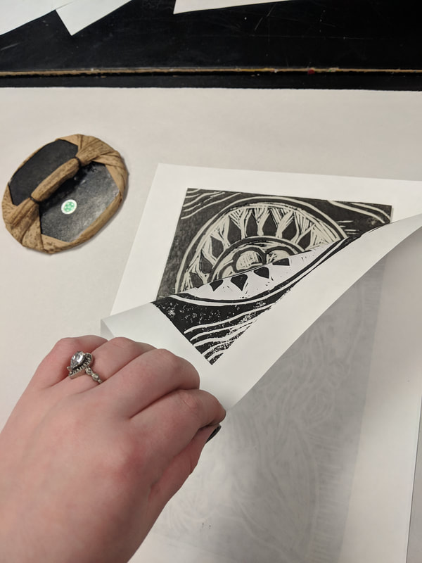
Planning and Carving the Plate
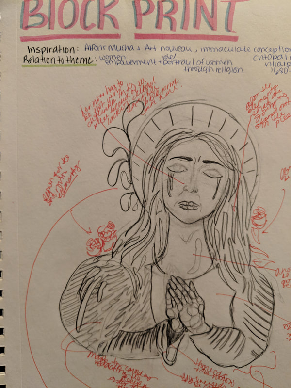
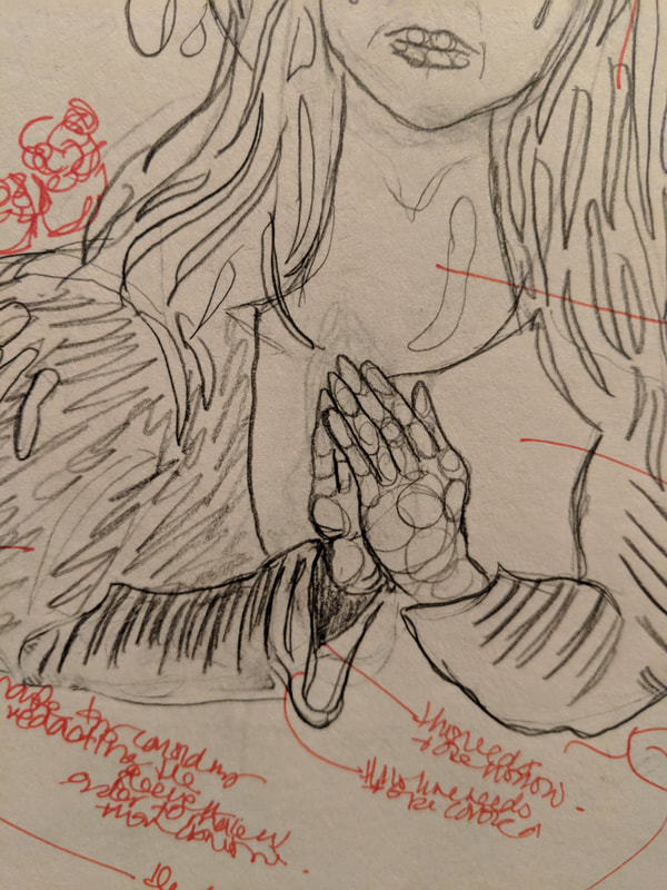
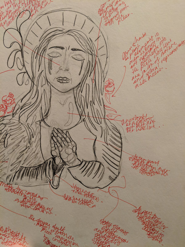
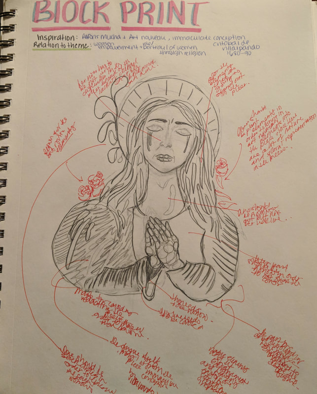
I wanted to take the figure from Villalpando's piece and incorporate some art nouveau elements. In the art nouveau movement, you rarely see women crying, or showing any other emotion other than a smile or desirable mood. So, I had decided to create a design, resembling some of the features of the many Mary paintings created by artists in history. With the sketch, I had realized that I would need to map out the several sections that would need to be carved and the sections that wouldn't need to be cut. The pencil markings that would be colored in would be carved out, and the rest of the empty space would be left alone. On the plate, I would have to incorporate floral elements as well as patterns that would resemble some of the elements in the art nouveau period. Circles often appear in the several paintings, and so I had decided to incorporate some within my piece. Carving the plate was quite difficult, especially when trying to form the circular patterns and when trying to carve the more detailed, smaller pieces, like the roses, and her hair, as well as her hands and fingers. The face was one of the most difficult when creating the features, like the eyebrows and eyes. The nose was the hardest to do, because I had to leave a strip of the plate raised to represent her nostrils and some of the side of her nose to represent the shadows. Making sure that the carved portions were deep enough was a bit of a gamble because, if you went too deep, you could go through the plate, however carving not deep enough, would result in your image not printing properly. During the process of carving her nose, I had gone a little too deep, and almost ripped the plate, however the carving wasn't deep enough to break the surface on the back of the plate.
Process
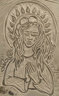
The complete linoleum plate, after all carving was finished
|
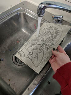
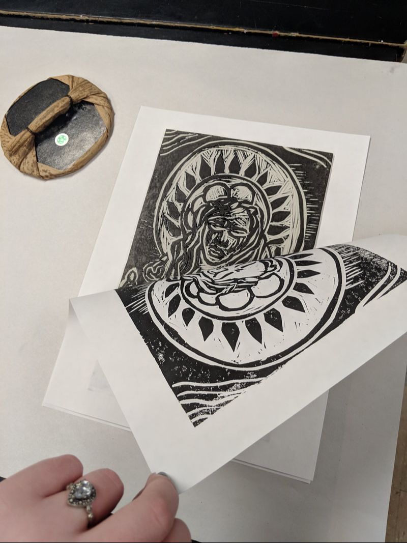
Before beginning the printing process, I washed the plate in order to reduce the amount of oil on there because of the fingers, so that the print would have no trouble producing a good print
|
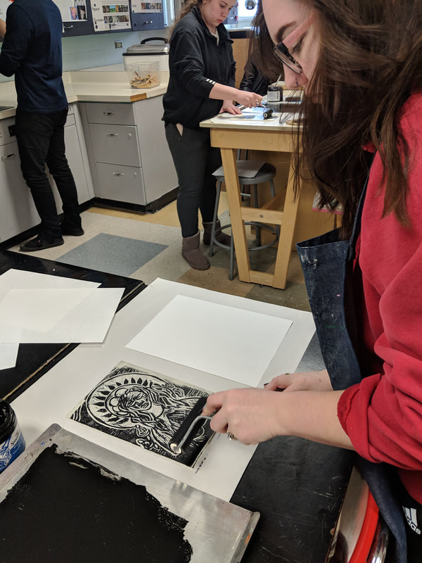
To the left of the photograph, there is a metal sheet, with the ink spread out. Before rolling, you carefully placed an appropriate amount of ink and rolled it out onto the ink plate, applying ink to the brayer
|
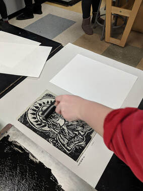
After the brayer had a sizable amount of ink applied, you then rolled the ink onto your plate, face up in front of you. As you apply the ink, your image should begin to appear a preview of the print
|
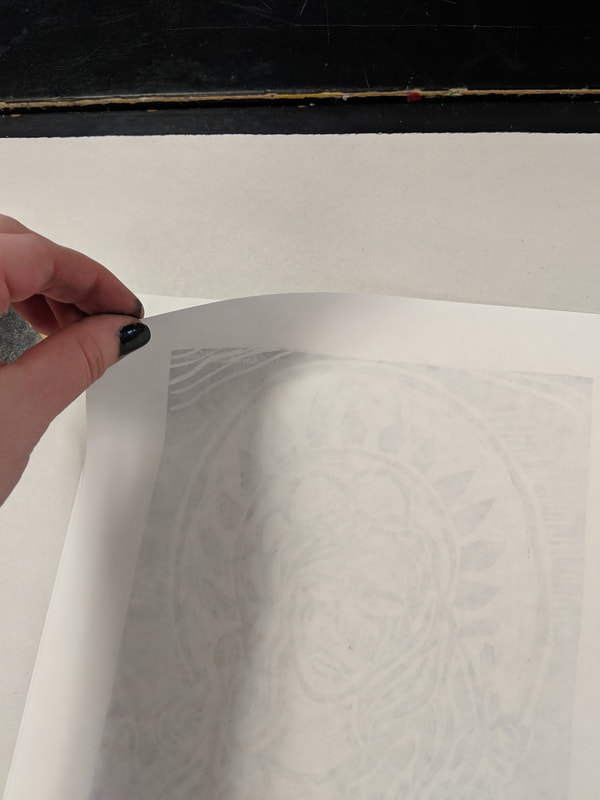
Placing the print paper next to you allows you to easily transfer the ink onto the paper, without much of a mess, or risk of getting ink onto the final piece
|
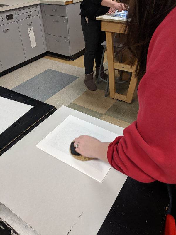
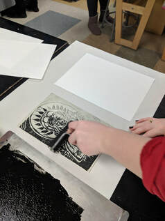
Once you have laid the paper onto the linoleum plate, I then used a bamboo baren to the paper. Rubbing in circular motions, applying a bit of pressure, will ensure that the ink transfers onto the paper, creating a bold block print
|
During this process, I found it difficult at first, because I had used ink that was really thick in consistency, which then made the print blotchy and not apply to the plate as smooth, compared to if I had watered it down a bit. Also, my first time printing the paper had moved slightly which made it extremely smudged and blurred, which made the first final print look terrible. So, I took all the mistakes I had made in the first one, and I had corrected them. I didn't wash off my plate for the second print, because I wanted to see if the extra ink would be helpful and make the piece more bold, and saturated. I also watered down the ink a little bit to make it less thick and was sure to mix it in order to get the right consistency needed. I laid down some more smooth ink onto the metal plate with some of the previous ink, and used the brayer to roll out the ink. I then rolled the ink onto the plate, going back and forth three times to make sure the ink had settled and was applied evenly onto the plate. I then took the print paper, and was sure to lay it down, straight and evenly. Once I did that, I made sure to apply a bit more pressure when using the baren, to make sure that the ink transferred onto the print paper evenly. After the second print, I thought it looked much better than before, and decided to use it as my final print.
Experimentation
|
|
|
|
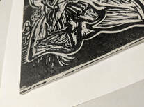
The first print that I had produced was bold, however it was a bit blurry, mainly resulting from an error I had made when applying the paper to the plate. My error being, a slip or slight movement of the paper in the process of applying the paper to the plate, and using the baren to rub the ink into the paper, creating a bold image. Also, the first time, my print was slightly speckled towards the bottom, something that I had not planned on. This might have been due to the ink being too thick, and not enough in order to print the image. So, I had tried it again, adding a bit of water to the ink, since it was water-based, and wouldn't affect the ink print. After adding water to the ink, making a little easier to spread and work with, I had also made sure to not move the print paper after setting it onto the plate, so that no smudge would occur. This, along with a little more pressure used with the baren, produce a decent print, that had no white blotches, and was a bold and dark image.
Reflection
Overall, I am satisfied with the outcome of the block print, and I like the craftsmanship put into the piece. However, I think my ideas could have been developed further and investigated more. I am not satisfied with the idea, and structural meaning behind the piece, and I think that more thought and effort could have been place in the execution of the meaning and more consideration into the delivery of the message of the piece could have been communicated more successfully. This project was difficult in the sense that not much detail could be captured. Art nouveau requires a lot of detail and floral elements, which may not have been the best choice for this project, as it made it more difficult to produce and execute. My print was okay, however it could have been done better, and there is a bit of white speckles to the left of the image. Her hands could have been positioned better. I hadn't considered the flip of the image when carving out the plate, and it wasn't until I was done with her hands that I had thought of the mirrored effect of the final print on the paper. Upon putting more effort and thought into the piece, it could have been done much more successfully than it has been executed currently.
Compare and Contrast |
Alphonse Mucha
Daydream/Reverie (1896) 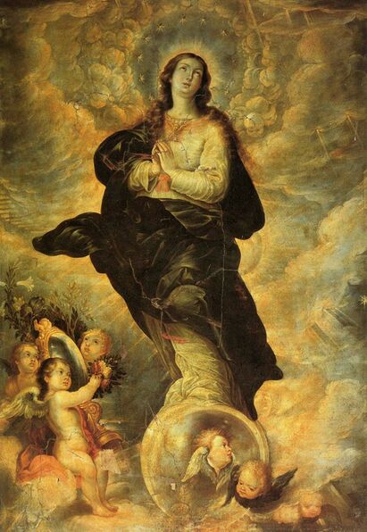
Cristobal de Villalpando
Immaculate conception (1680-90) |
Similarities
Differences
|
|
Act Responses
1) Clearly explain how you are able to identify the cause-effect relationship between your inspiration and its effect on your artwork.
Cristobal de Villalpando’s ‘Immaculate conception’ inspired me to use the female figure, Mary in my block print, Mucha’s piece affected the way I visually represented and portrayed the female figure according to my personal experiences and opinions of young women in society today.
2) What is the overall approach the author has regarding the topic of your inspiration?
The authors are presenting information from an art historian standpoint, giving information on the artists and their bodies of work.
3) What kind of generalizations and conclusions have you discovered about people, ideas, culture, etc. while you researched your inspiration?
I discovered that there are various renditions of the seven sorrows of mary, as well as the female representation of mary in general, through various artists and art movements.
4) What is the central idea or theme around your inspirational research?
The central idea I was aiming upon my research was the representation of women through art movements, and how they were portrayed through various artworks.
5) What kind of inferences did you make while reading your research?
I inferred through my research that Cristobal de Villalpando was a prominent artists in the spanish renaissance period, and created many works based on that of stories from the bible.
Bibliography
Artinfo, Blouin. “Mexican Painter of the Baroque: Cristóbal De Villalpando at the Met, New York.” Blouin Artinfo, Bloun, 10 Oct. 2017, www.blouinartinfo.com/news/story/2577806/mexican-painter-of-the-baroque-cristobal-de-villalpando-at."Alphonse Mucha Artist Overview and Analysis". [Internet]. 2019. TheArtStory.org
Content compiled and written by Jen Farren
Edited and revised, with Synopsis and Key Ideas added by Ellen Hurst
Available from: https://www.theartstory.org/artist-mucha-alphonse.htm
Content compiled and written by Jen Farren
Edited and revised, with Synopsis and Key Ideas added by Ellen Hurst
Available from: https://www.theartstory.org/artist-mucha-alphonse.htm
