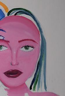
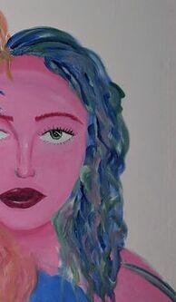
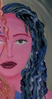
Self Portrait
|
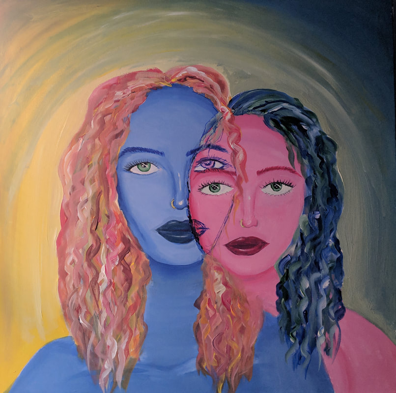
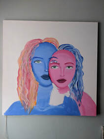
Title : prospection and perception Size : 91.44 cm x 91.44 cm Medium : Acrylic on Canvas, and Sharpie Completion : April 2019 |
Exhibition Text
Through the inspiration of Picasso's ''Two Lovers'' and Alex Garant's ''Way Up'', I was able to create my self portrait using acrylic paint and sharpie. The piece symbolizes personal struggles, like mental illness, representing how I present myself and a reflection of how my emotions affect my art and creativity, as well as how I paint and portray people in each of my pieces.
Inspiration

Alex Garant
Way Up 12x16 
Picasso
The Lovers (1923) |
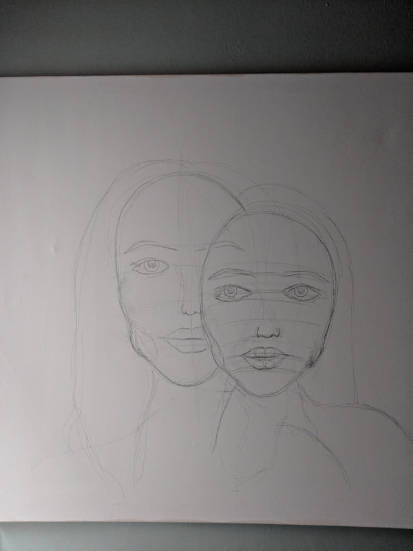
I had two planning sketches and ideas for my self portrait, and I debated for a long time which one to choose. The first sketch on the left, was inspired by Alex Garant and Picasso. The second sketch on the right was going to be inspired also by Picasso, and Francis Bacon. I wanted to use Picasso as inspiration for the color palette, using blues and reds to represent his blue and rose period. This symbolized my struggles with mental illness as both an individual and an artist. The overlapping was more of a structural element in the piece, because Garant often overlapped several of the subjects features and faces. The second piece, I was going to use one of Picasso's portraits as the basis of the position of myself in the painting. I was going to replicate the Picasso portrait and then paint over my face with more of Bacon's style and elements in his pieces. The more I deliberated, the more the overall concept of the first sketch won me over, compared to the second sketch. I wanted to truly love the piece both physically and conceptually for my self portrait, which is why I had decided to choose the first sketch instead of the second sketch.
The color scheme and application of Garant's piece 'Way Up' was striking to me and so I wanted to have that concept in my piece, the contrast of the blue and the red and the two coming together and unifying the overall figure in the piece. Picasso had his Blue period and Rose period, which I also drew inspiration from, and so, incorporating the two and carrying my own meaning within those colors was important to have in my self portrait. In Picasso's "The Lovers" there had been both blue tones and red tones, something he used in both the Rose period and the Blue period, so the combination in this piece is kind of what I wanted to do in mine. This brought me to come up with my first sketch and design concept. These two inspirations worked more conceptually and physically for me than the second sketch had, which was important. |
Planning sketches and Ideas
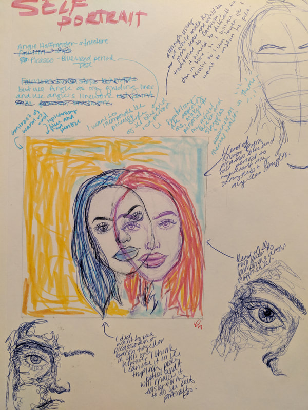
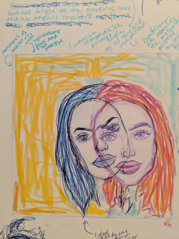
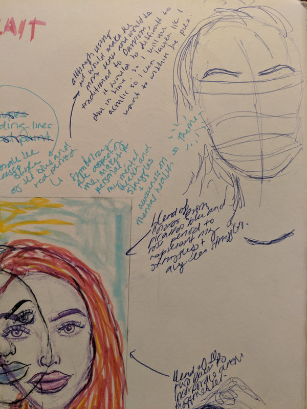
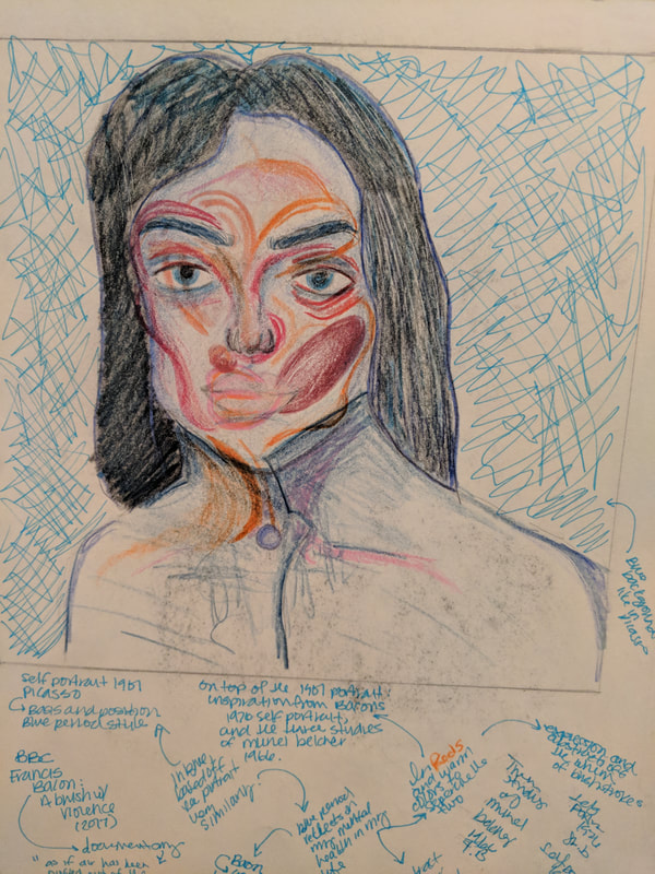
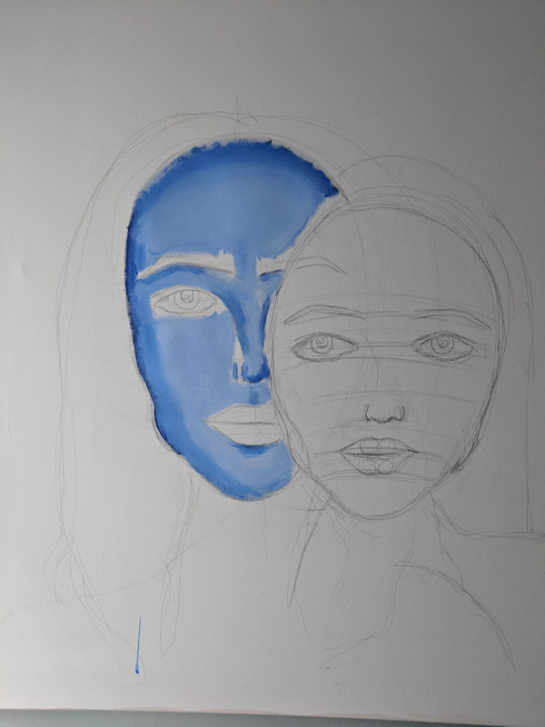
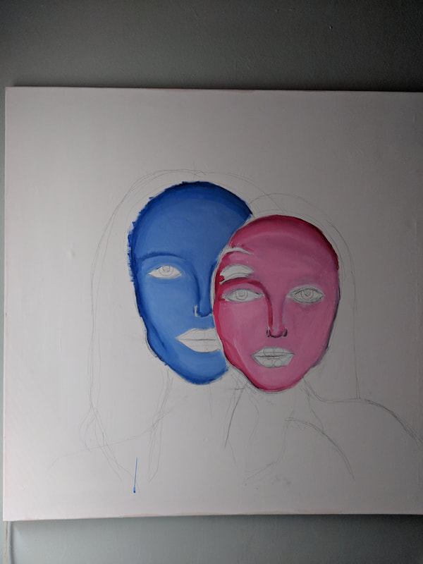
I had decided to use the first sketch, with Picasso and Garant the main inspirations. The blue side of the painting represents my struggle with mental illness in my life and how it affects my creativity and artwork. The 'rose' side represents me when I am in my best mental state, and at my best, and how that affects my creativity and artwork. Mental illness is a big part of my life, and so the blue figure is slightly larger than the rose pink figure to show that my mental illness will always be a part of my life, and will have a significant affect on my life, but that it is connected with me at my best mental state. The yellow mustard background with the blue figure represents light and hope even in a bad mental state. The rose pink figure with the gray blue background represents moving forward and using my mental illness to become better, cope better, and create more art. Creating art has allowed me to express my emotions without using words, allowing me to use the negativity to create a beautiful piece of art out of pain, it will always be one of the most fulfilling accomplishments of my life. I was planning to overlap the faces, to stay true to Garant's style and artistic elements, however I also wanted to stay true to Picasso and his smooth textures in the 'Two Lovers' piece.
Process and Experimentation
Process
|
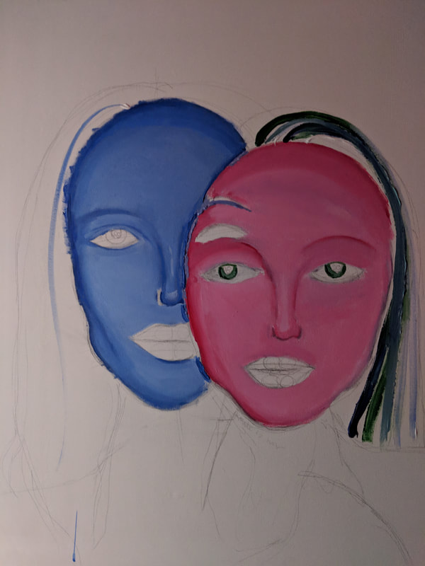
I began with the blue figure, painting both the highlighted and contoured features on the face. I used a very soft sky blue for the highlight and a dark, almost chromat blue for the contours in order to achieve the dimensional look on the figure. I then began to do the same thing with the rose pink figure, however I did not want to do the contours as harsh as I had done on the one previous. I wanted to keep the right side of the rose pink figures face (my face) more light and not as heavy in order to achieve the feeling of relief and contempt. The dark and heavy contour on the blue figure would have a more saddened heavy feeling because of the harsh contours of the face and melancholy color. I used a technique from the Baroque period, like a Baroque method. I often use it when painting human figures or subjects when trying to achieve a smooth look. You apply your darkest color, or contour on your painting palette, and then, next to that, your lightest color, or highlight on your painting palette. Then, take your brush and brush in between both the highlight and contour as many times as you would like to get the wanted result. This creates a transition, or gradation between the two colors, which makes it blend more easily. This is extremely helpful when painting a face or body, because you don't have to worry about harsh unintentional lines.
|

|
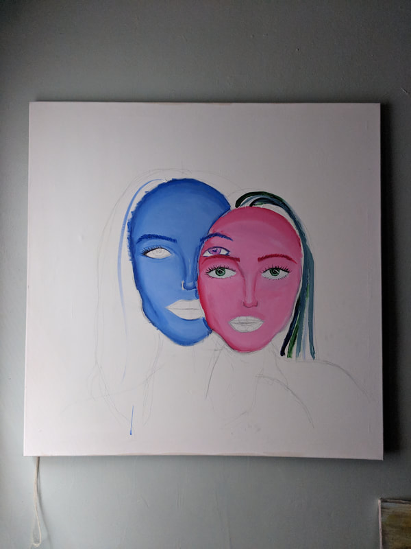
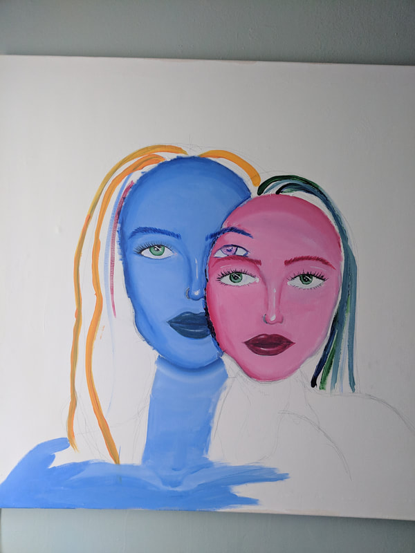
After many washes and retouches, as well as reapplying of highlights and contours, both faces were somewhat complete. The skin had been done and blended to my desired result, and I then began on the eyes. I had to overlap a lot of light and dark areas in the eye in order to make the eyes look realistic. After completing the eyes, I then moved onto eyebrows. Using the darkest contour color, I used light brush strokes to make it look like hairs. I applied some lighter color on the brows in order to make the brows look more natural and realistic, not that it was just one tone. After the eyebrows, I had done the lips, which on the outer corners I applied the contour color and on the inner part of each lip, I applied the highlight color. I then went over it with a color that would blend into both the contour and the highlight, which gave the lips some dimension. A white highlight to each lip was then added to make them have a glossy appearance. Some white highlight was also added to the nose in order to noses in order to make the noses appear more sculpted and bold. After the overall face was completed, I used the same technique to finish the neck, chest and shoulders of myself in the painting. The second to last step was the hair, which took some experimenting to finally get right and have look relatively nice. It was a lot of trial and error on layering and color effect. The very last step was the background. I wanted the yellow to blend into the blue and blue into the yellow, with the lightest parts surrounding the two figures (me). This would create somewhat of a vignette effect to the piece, and draw your attention to the center of the painting, which is an effect I wanted because it allows you to focus on the faces and the detail.
Experimentation
|
|
|
The hair was particularly tricky and difficult to figure out how to create dimension and a realistic appearance to it. I thought it would be easier to obtain this if I had had the hair be curly or wavy rather than stick straight, because that would allow me to do layers rather than figuring out the highlights and shadows of the hair, if it were straight. I soon figured out that layering was key, both of light and dark colors. Placement of the colors mattered a lot and altered how the overall hair looked. You couldn't have areas of the hair be too dark, or blotches and patches of dark blue colors, and you couldn't have areas of the hair be too light because then it would be washed out in the background. I do admit, I wish on the blue figure with the rose pink hair, I wish I would have done more darker red tones and pink tones within the hair, rather than dull more toned down warm colors so that it wouldn't get so lost in the background with the yellow.
Compare and Contrast
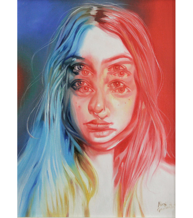
Alex Garant
Way Up 12x16 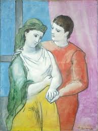
Picasso
The Lovers (1923) |
Similarities
Differences
|

|
Reflection

|
Now reflecting back on my piece, I wish I would have used the same technique on the left side with the hair as I had on the right side with the hair. The blue hair is far more dark and well executed than the rose pink hair. Because of the darkness of the blue tones, it develops a heaviness to the right side of the painting, and the background being dark also heightens that heavy feeling. This disrupts the balance on the piece because the pink and rose tones are not as strong as the blue tones and values, which could be distracting to the viewer. I do however, think that the vignette like background helps center the focus to the faces and facial features in the painting. This I think allows the viewer to pay attention to the features and details within the face. I also like that the pink rose figure blends in with the rose pink hair, because it connects the two a bit more. However, I wish that I would have done the same with the blue, and blended the blue tones of the hair in with the skin on the blue figure. This would have make both figures equal and more connected in that aspect. But, I think that this piece is overall well done and the concept is as strong as I had imagined and planned.
|
