Choice Piece
|
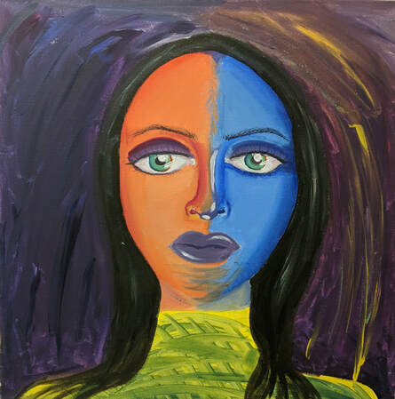
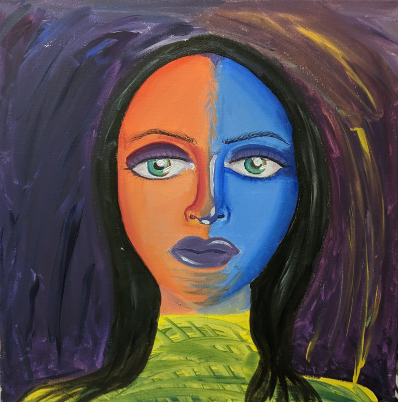
Title : melancholy and tranquility Size : 50.8 x 50.8 cm Medium : Acrylic on canvas Date : February 2019 |
Exhibition Text
Through the inspiration of Picasso's two pieces, "The kiss" and "Two Lovers", I was able to create my acrylic painting to represent mental health in ones life. The piece symbolizes the struggle an individual goes through in their life, and the struggle with depression and mental health awareness in modern day America.
Inspiration

Picasso
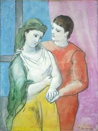
The Lovers (1923) |
I wanted to use Picasso's blue and rose period in order to represent the 'ups and downs' individuals may go through in their life. Something may happen to someone, like Picasso, whose friend had passed, leading him to a depressive state. The rose period, in my piece, represents ones normal, happy life. The Lovers, I felt best illustrate that, because it has a balance between both the blue and red tones, and the painting is symmetrically balanced with colors, cool being on the left, and red and rose tones being on the right. I used Picasso's 'The Kiss' painting as inspiration for the woman's facial features. In this piece, the eyes are particularly large,along with the nose. I found this interesting when depicting people. So, I had decided to enlarge her eyes and nose and mouth to somewhat capture some of Picasso's shape and line in my piece.
|
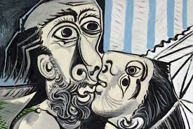
Picasso
The Kiss (1969) |
Planning
|
I wanted the piece to be split, cool tones on one side and rose tones on the other side of the canvas. I also wanted to emulate his style in 'The Kiss', and so I was sure to draw her features larger than you would to scale. I wanted it to have various cool colors, like aqua and navy blue, and rose red, and sunset orange. These variants in colors would allow me to blend them more easily, and create highlights and shadows to define her face. I wanted to use the shapes and similar features Picasso had used for more so technique and inspiration compared to completely committing to the recreation of that specific piece. The Lovers had offered me inspiration on the split canvas idea, which perfectly fit into my idea for this choice piece.
|
Process and Experimentation
With the eyes, I had experimented a bit on the correct color and variants within the iris. It was also difficult choosing a color for the eyes. Since I was going to have purple as the unifying color on her face, I wanted something bold, something that would compliment both the warm and cool tones. I figured green would stand out the best, and make the eyes stand out, as opposed to any other color. Using any other color, like a warm orange or an ice blue would result in an imbalance, as it would throw off the warm vs cool side of the piece.
|
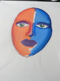
Initially, I had started out with her face drawn onto the canvas. I was sure to scale the head shape and the neck onto the canvas, however, the main features of the face would be a little off considering the proportions and shapes themselves were meant to be distorted. After I had mapped out everything on her face, I began painting the left side. I used blending techniques often used in the baroque period to blend the various gradients of color together in order to make shadows and highlights in the piece. Initially, I was going to just have the warm tones and cool tones meet in the middle, drawing a direct line down her face, however, I wanted to have some unity in the piece. The unity would represent the normality in the piece, showing life has both its struggles and its achievements, and learning to balance both can be difficult. Mental health is both important to recognize and take care of, as it is a large part of your identity and how you function in society. Using the baroque method was difficult, especially painting on a larger canvas, it allowed more room for error. However, during the painting process, the easier it became to build up both the shadows, contour, and highlights of the piece. This would allow me to define her face, and also make her eyes seem large, as well as her other facial features, like in Picasso's piece.
|
The eyelids, partially the nose, and the mouth and some of the forehead are a lighter violet purple. The muted violet stood out best in the piece. Getting the warm and cool tones to blend into the muted violet was a difficult task because I didn't want the two colors to mix and create a dark brown muddy color down the middle of the painting.
|
Compare and Contrast
Picasso
The Lovers (1923) 
Picasso
The Kiss (1969) |
Similarities
Differences
|

|
Reflection
|
Overall, I am satisfied with the quality of the acrylic painting. However, my inspiration and connection to Picasso could have been stronger, which would have put more depth into the piece. I did try to capture the shape of the eyes and features in Picasso's 'The Kiss' in order to have some connection to the piece. The flashes of yellow in the background and navy blue are opposite on purpose. I wanted to connect and unify the warm and cool tones by adding more balance to the piece itself, without changing anything to the face. I chose to do a yellow and green shirt, because I wanted to both tie it into the green eyes, and provide more of a balance, and also to capture some of Picasso's vibrancy in the piece. During Picasso's cubist period, he would always use very bold, vibrant complementary colors. The colors would help make the piece bold and appealing to the eye. I had tried my best to do the same, and stay as true to Picasso as possible, while also incorporating my own artistic style into the piece as well.
|
Bibliagraphy
NGA. “The Lovers.” Artist Info, National Gallery of Art, www.nga.gov/collection/art-object-page.46667.html.
