MIAD 'IMAG(E)INE COMMUNITY'

|
|
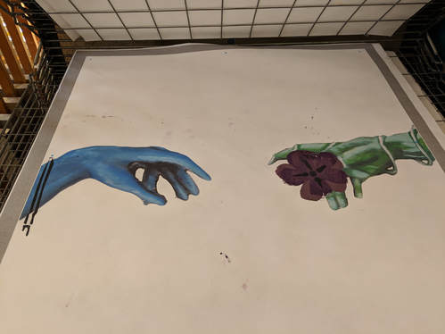
Title : Adversity and Privation
Size : 91.44 cm by 91.44 cm
Medium : Digital Manipulation using photoshop and Acrylic on Chipboard (stencils completed through silk screening process, using Butcher Block paper)
Completed : November 2018
Size : 91.44 cm by 91.44 cm
Medium : Digital Manipulation using photoshop and Acrylic on Chipboard (stencils completed through silk screening process, using Butcher Block paper)
Completed : November 2018
Exhibition Text
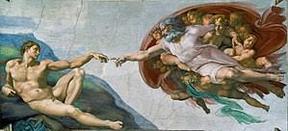
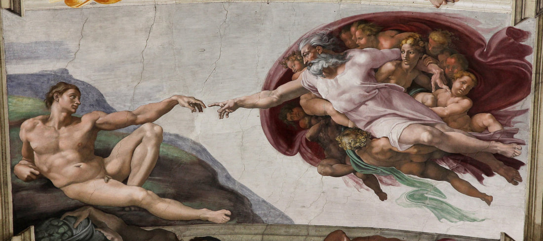
Both pieces are based off of Michelangelo's “Creation of Adam” representing Milwaukee’s adversities and strengths. All stencils incorporated within the pieces are intentional and signify special meanings. In respect, I would like to leave that up for interpretation for the viewer. This allows them to determine the syzygy and opacities of the two pieces for themselves, allowing them to construct personal meaning and significance pertaining to their life and own communities.
Inspiration
|
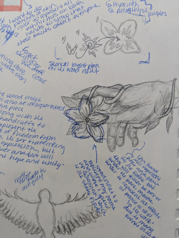
I wanted to represent the Milwaukee community for the MIAD project. When we were first notified about the project, I had an idea of what I wanted the piece to look like. I wanted to structure my piece around both hardship and hope, and so I felt that Michelangelo's "Creation of Adam" was the perfect piece to emulate. I felt that I could incorporate the contrasting perspectives of the city through the hands of both "god" and "Adam", god representing a hopeful, peaceful outlook towards the future of the city, and "Adam" representing our city's hardships and struggles. Upon my research, I had decided to involve Wisconsin's state flower, the Wood Violet, and Wisconsin's state bird, the Mourning Dove. The Wood Violets would be incorporated into both of my pieces, and the Mourning Dove would be a stencil addition onto the second piece. The symbols and drawings offer both adversity and privation, which is the overall surrounding theme of the two pieces. Milwaukee was and is one of the top cities for gun violence, sex trafficking, opioid use, and poverty. I wanted to show a bit of 'harsh truth' to the piece, but still offer tranquility and hope for the future, to show that we are 'working towards a better community'.
|
Michelangelo, Creation of Adam, from the ceiling of the Sistine Chapel in the Vatican, Rome, 1508-1512, fresco
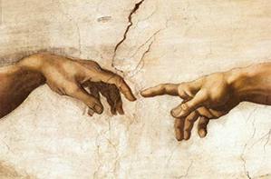
Michelangelo, Creation of Adam, from the ceiling of the Sistine Chapel in the Vatican, Rome, 1508-1512, fresco
|
Planning
|
I knew as soon as the project was introduced that I wanted to draw inspiration from Michelangelo's piece because I knew that I could incorporate many meanings and metaphors in order to communicate the message of community. I began sketching the hands right away, and brainstormed which community I wanted to portray, and give definition to. Of course, my mind immediately went home, the place I know very well and grew up in. Now, us, as students, weren’t subjected to a community in a sense that it had to be a specific location, however, I wanted to tie my idea to a place, and keep it broad, in order to not only make it easier to incorporate multiple meanings but also gather many perspectives. I researched more into “The Creation of Adam” in order to gain understanding on what Michangelos goal was in his portrayal, which would make it easier for me to give specific placement to the two hands, and add onto them, giving them my own personal meaning and portrayal in the sense of the city.
|
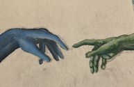
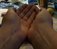
My First Piece, an interpretation of the "Creation of Adam"
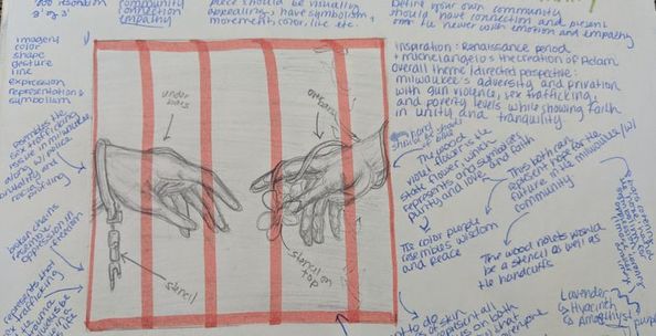
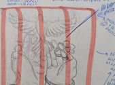
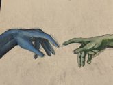
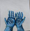
I decided to have the left hand represent the oppressed and struggling within the Milwaukee community, and the right hand represent hope, peace, and tranquility. It touches on the harsh reality of the city, and the hope for a better, brighter future, something to keep reaching for. The left hand is oppressed because I took into consideration that the left hand was the hand of Adam, which is a character in the bible. I think that the hand of ‘Adam’ could represent the struggling people within the Milwaukee community. The right hand is the hand of god in Michaelangelos piece, which I portrayed as the hopeful hand, of a better future. The reach of the two hands are significant in the fact that they both acknowledge the struggle and the gap to a more brighter look on the city, and the strive to do better within the community. For my two stencils on the ‘Creation of Adam’ piece, I had decided to do the Wisconsin state flower on the right hand, or the hopeful hand, which is a mixture of green tones, such as tea, fern, and hunter green, and a handcuff on the left hand, the hand of the oppressed, in a mixture of blue tones, such as aegean, indigo, and spruce blue. The Wisconsin state flower, is the wood violet flower, a periwinkle purple, which is supposed to represent purity, love and faith. The handcuff is just as significant because it resembles the struggling people of the community, whether it be victims of police brutality, opioid addiction, human sex trafficking, racial profiling, rape, or gun violence. These are just some of the things, among others that the viewer may think of when looking at the piece. The reason I wanted this to be quite broad and open ended, is because I want everyone to be able to have a personal connection to the piece that they can relate to their own community or hometown. According to the sketch, my third stencil would be the bars on the piece, however, after being critiqued, I wanted to go a more simple route, and keep the two hands as the focalpoint in the print.
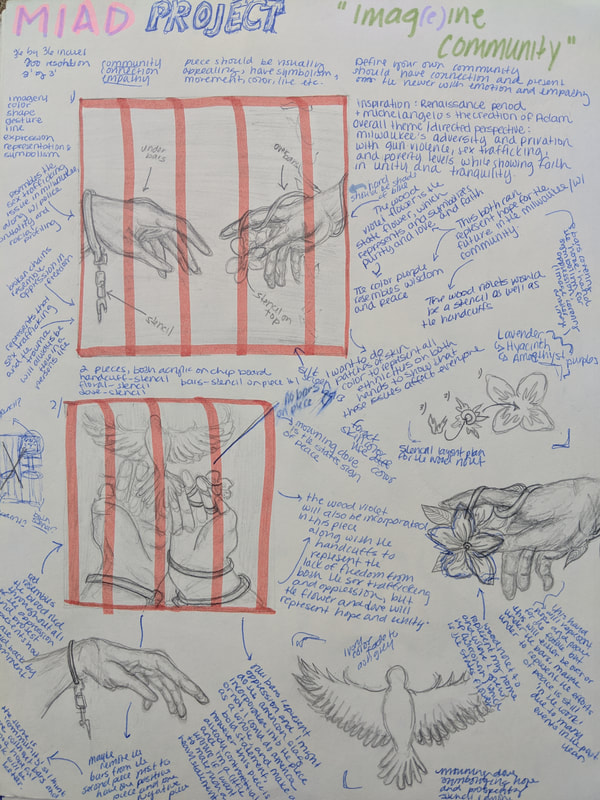
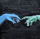
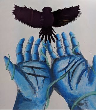
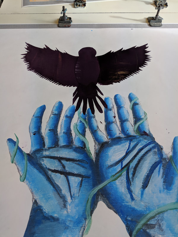
My second piece, inspiration from Michelangelo
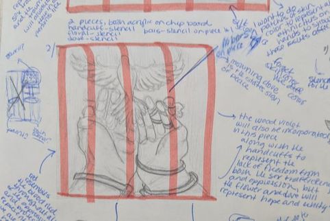
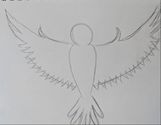
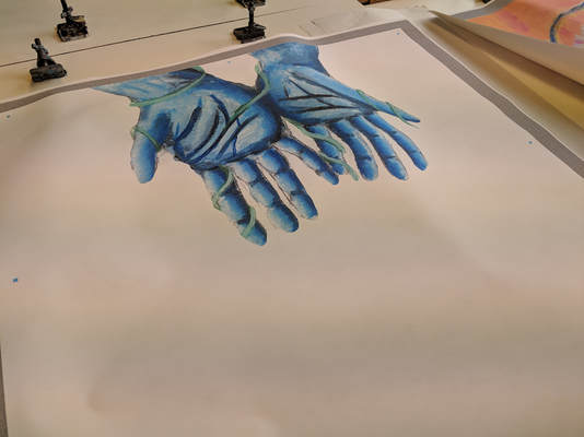
My second piece, I was inspired by Michelangelo, however I wanted to do a rather original piece for the second portrayal. This time, I decided to incorporate the aegean and indigo blue hands, releasing a mourning dove, which is the states bird, in an eggplant purple or violet, with a slight hint of canary gold. The color violet resembles dignity, wisdom, and peace, and canary gold symbolizes courage, passion, and love. Originally, I was going to incroporate the handcuffs, and wood violet flower, but I wanted to do a more positive image for the communtiy, as opposed to the other one, that showcases the hope and hardships. This piece is meant to be more positive, the abused hands releasing ‘hope and prosperity’ into the city, ‘rising up from adversity’. Originally, I was going to do a black background on the first piece, and a white background on the second, however, I realized that both looked coherent and unified with both white backgrounds, allowing the viewer to be able to focus on both hands, and making it easier to view from the street.
|

|
|
Process and Experimentation
|
I began painting on the two chipboards and photographed my process throughout. I find that it was difficult when trying to get the proper highlights and shadows onto the hands in both pieces, because of the way they were positioned. However, once I had done a wash after laying both my highlights and shadows down on each handpiece, the structures became more clear, allowing me to paint easily. However, the left piece, I didn't like the black background, probably one of my largest regrets on this piece. I did fix it in photoshop, and gave them both clean white backgrounds digitally to make them more clean.
|
|
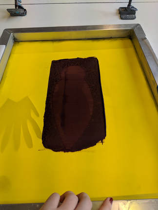
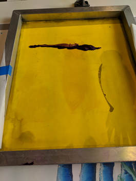
The Screen Printing Process
1. Draw and cut out the stencils on the freezer paper. Be careful not to leave any open spaces or floating objects within your stencil, as these cannot be cut out. Also remember, that your stencil is reversed, so reverse your image accordingly. After cutting out your stencils on the freezer paper, lay out your background on a flat surface.
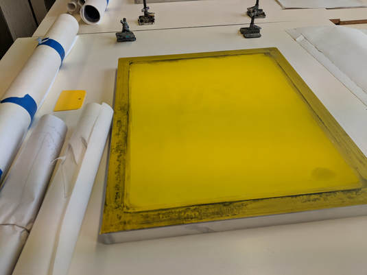
2. Lay your stencil cut out on your freezer paper onto the screen, and secure each end with tape, so that it is flat and tight on the screen. If there are any lines, the paper isn't straight, or the tape isn't tight enough, this can create problems for you and your printed screen, so make sure you have a good grip, and clean image showing through. (You may want to adjust the tape or paper once you lay it down and position it on your background)
3. Now choose the color of the ink, and use a spoon to only cover enough of the entire image, not from the ends of the screen. Then, you will pull the ink, leaning at a 45 degree angle, downwards, in a sweeping motion, applying slight pressure. Be sure not to go all the way to the bottom/top of the screen, as this will create more of a mess than you already need. You want the pressure to be equal throughout the printing process, otherwise it can create unintentional lines, ridges, and patterns when printed.

|

|
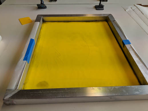
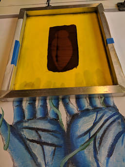
4. When you pull the screen, and you are done with the stencil, or want to switch colors, then you are going to do what is called 'flooding'. Being sure to get all the ink to the bottom, and then scoop up the excess ink and put it back in the bucket. Carefully lift up the screen, being sure not to smudge anything, or have your background fold on itself. After you have lifted up the screen, you can put the stencil in the garbage, and go and rinse the screen.
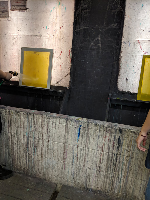
5. Be sure to get all the excess ink left on the screen, as this can be damaging to the next print you pull, or future prints. It is important that the screens remain reusable to eliminate excessive material usage. Once you are done rinsing your screen, carefully dry your screen using a soft towel, or hair dryer. Repeat the process if you have any further stencils or pieces.
Experimentation
|
Throughout the painting process, I had to experiment with different angles for my second piece, and how I wanted the hands to be positioned in order to get the right angle and lighting, as well as highlights and shadows. I didn't want the palms to be too close together, because that wouldn't quite look like the 'releasing' motion I was hoping to obtain. So, I played around with a few positions for the hands, and decided to go with a balance between the two, allowing space in the palms and fingers but still somewhat together.
The hands were rather easy for the first piece because of Michelangelo's reference, however the second one was a bit difficult because of the fact that I had to make my own references, highlights, and shadows. |
|
I did experiment with the inks, seeing if the canary gold would even show up with such a powerful, vibrant violet. It did show through in some parts of the wing and the body, which I am happy with. Although, I do wish that I had put more canary gold on the ink line before hand, and less violet, so that they could mix better, without the hue of the violet overpowering the value of the canary gold. I wasn't sure how it was going to turn out, these inks were a lot more watery than any inks that I have worked with before, which if I remember correctly, were water based. However, to my surprise, I was pleased with how opaque they were in color for being light.
|
Compare & Contrast

|
Similarities
|
Differences
|

|
Reflection
Overall, I am satisfied with the second piece that I made, however, I don't quite like how the stencils turned out on my first piece, just because the flower covers more of the hand than I wanted and anticipated. This just isn't what I originally had in mind because I imagined a smaller wood violet flower. The handcuff looks okay on the first piece, however, it doesn't look its best, and therefore the first piece isn't my strongest, nor is it executed as well as it should have been. I did run into some complications during the process, the problem was that the sheets of paper were so thin for the stencil, and my background was a clear white, that some excess ink somehow got onto certain places on the white, like under the hand, where it shouldn't have been. This unfortunately isn't something that is easy to fix, unless I were to reprint my background and screen print again. I just wish that I would have been more careful with watching the ink, and making sure it didn't splash or smudge on any of the two backgrounds.
My second piece is my strongest piece, and ironically it is the piece I printed on first. I think that because my stencils for the bird were very simple and bold, it was easier to capture a clean print, compared to my flower stencil, which was intricate, and the handcuff, which were very thin lines. We were warned that the problem with the intricate stencils, they may not turn out as well as planned, and so I think that with future projects, I will try and remember to create large bold lines and patterns in order to obtain a well executed print.
Some problems many students ran into were the inks staying onto the screens. Having worked with screen printing before, it is very important that you wash the screen as soon as possible, to prevent the ink from drying on the screen or leaving residue of any kind. There were several sponges there, which helped many students scrub the ink off while waiting in line, so that when they got to the washing station, the ink would easily come off. It was really important to get any existing ink off of the board to prevent unintentional mixing of colors onto the backgrounds.
A classmate of mine did their piece digitally, which when printed turned out very elegant, with clean and vibrant lines and edges. I wish I would have thought of doing digital art, as opposed to acrylic on chipboard and then scanning it into photoshop. This way I think my backgrounds wouldn't have been as blurry, and it would print better, because it was a digitally made image, compared to a photograph of a painting, transformed to a different size. The risk of doing what I did, was a pixelated image. However, I am not too worried about the visuals from afar, though I still critique myself on my craftsmanship for both pieces. The second piece of mine, turned out better than the first, and I am more pleased with the second piece for execution, but I am more pleased with my first piece for theme and meaning, because it has more components than the second piece does.

|
ACT Connections |
1) Clearly explain how you are able to identify the cause-effect relationship between your inspiration and its effect on your artwork.
Michelangelo's 'Creation of Adam' inspired me to create two pieces representational of the Milwaukee community for my MIAD project. Michelangelo's piece affected my portrayal of the city, and how others may visually perceive my presentational perception of the community.
2) What is the overall approach the author has regarding the topic of your inspiration?
The authors are presenting information from an art historian standpoint, giving information on the 'Creation of Adam', analyzing various elements and principles within the work to inform the reader on the meaning of the piece.
3) What kind of generalizations and conclusions have you discovered about people, ideas, culture, etc. while you researched your inspiration?
Previous to this project, I have researched various issues and struggles people within the Milwaukee community are experiencing, or have experienced, such as police brutality, sexual assault, human sex trafficking, opioid addiction, and gun violence. The 'Creation of Adam' is a beautiful piece, portraying 'Adam' reaching for 'god' his 'creator', in a hopeful sense. I felt that this could portray a struggling city, full of humans who both make mistakes and go through hardships, reaching for a sense of peace and tranquility, and a better future.
4) What is the central idea or theme around your inspirational research?
The central theme or idea I was trying to convey around my inspirational research was beauty within a broken city. 'god' created 'Adam', as a human, who makes mistakes, but also is hopeful for the future, 'god' being that hope, and sense of peace. The hand of 'Adam' is representational of the Milwaukee community, and the hand of 'god' is representational of the better future the city strives for.
5) What kind of inferences did you make while reading your research?
An inference I made while reading my research was the dedication Michelangelo must have had to the Sistine Chapel piece, because it took him nearly four years to complete the 9′ 2″ x 18′ 8″ piece.
Bibliography
Bertman, Sandra. “Creation of Adam.” NYU Langone Health, NYU Langone Medical Center, 28 June 1999, medhum.med.nyu.edu/view/10326.
Color reproductions exist in Hartt (before the ceiling's cleaning) and in Steinberg (after the cleaning): Hartt, Frederick. Michelangelo. New York: Harry N. Abrams (1984); Steinberg, Leo. Who's Who in Michelangelo's Creation of Adam: A Chronology of the Picture's Reluctant Self-Revelation, Art Bulletin, 74:4 (December 1992), pp. 552-566. For excellent color reproductions of the Sistine Chapel paintings see: Carlo Pietrangeli, et al. The Sistine Chapel: A Glorious Restoration. New York: Harry N. Abrams (1994).
ItalianRenaissance.org, "Michelangelo’s Creation of Adam," in ItalianRenaissance.org, September 14, 2012, http://www.italianrenaissance.org/michelangelo-creation-of-adam/.
