Project 2
|
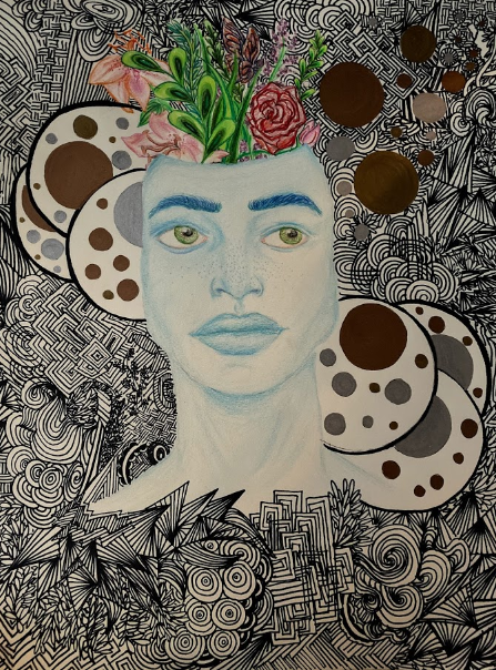
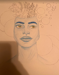
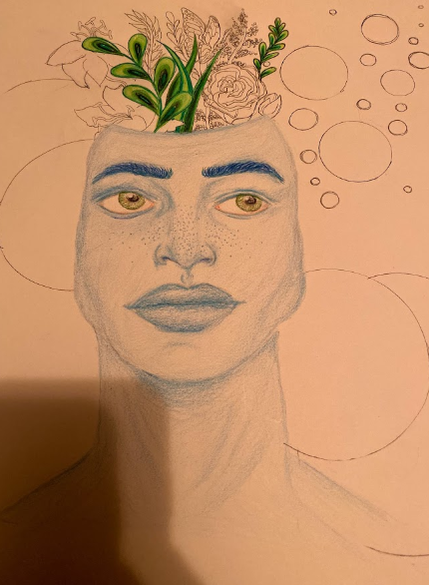
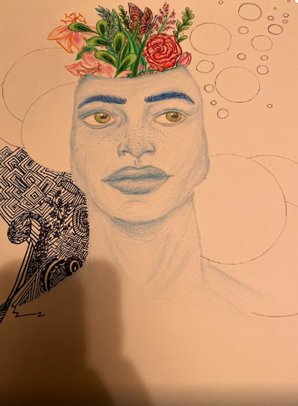
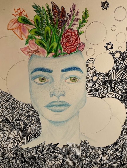
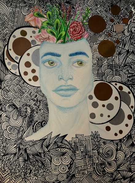
TITLE: Feminine Masculinity MEDIUM: Colored pencil and sharpie on paper DIMENSIONS: 14 x 17 cm DATE COMPLETED: October 2019 |
Exhibition Text
I was inspired by the acrylic print by Pedro Tapa called 'choose your own path' in order to create my pieces detailed designs surrounding the male figure in order to relate to humans relationships with the earth and the environment, and how connected we become when we are aware of our intertwining relationship with the Earth.
Inspiration
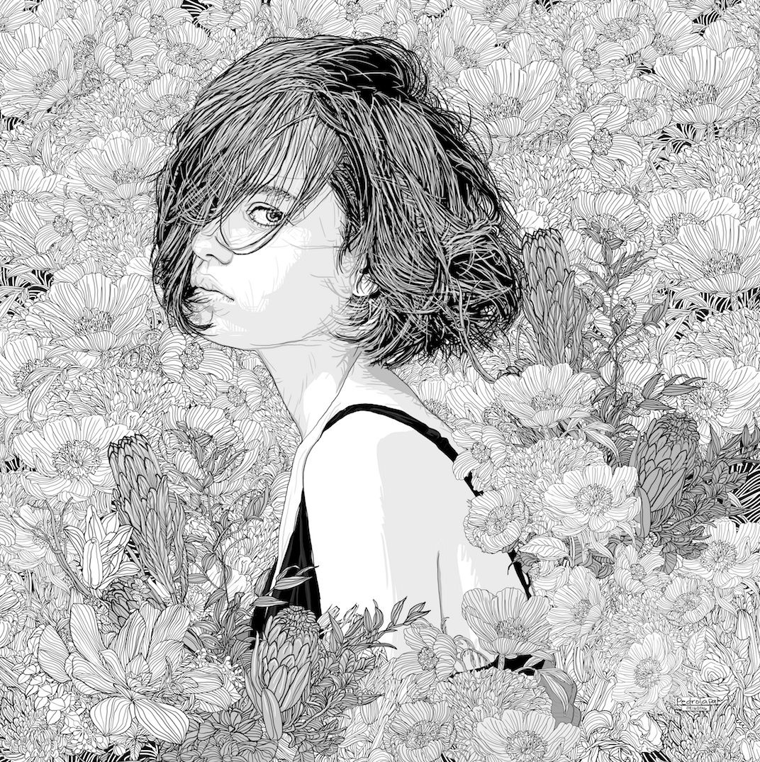
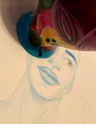
Choose Your Own Path, Pedro Tapa, Digital Illustration using Photoshop
Completed August 15th 2016 |
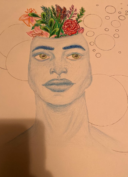
Pedro Tapa is an artist from the Philippeans that creates digital illustrations using Photoshop. All of his works are exclusively females and often surrounded in various flower patterns in the background, in either black and white, or occasionally some color. His exclusivity to the female form has to do with adoration and preference to the female facial structure and beauty. His illustrations often depict females with little expression. He likes to draw them that way so that the beauty is captured in the shape and light of their face. He is particular about how he draws their hair, and which direction it moves. The female figures he uses most often are from fashion magazines, or people that are in his mind whom of which he never met or seen before. He used to use a lot of color in his non-digital drawings, however when he switched from raw illustration to photoshop and digital work, he began to use color more sparsely only popping in the hair or floral patterns in his work. Since Pedro Tapa is a relatively new contemporary artist, so this work is fairly recent, created in 2016. I like to incorporate flower designs and patterns into my zentangle designs. Instead of having a black and white illustration, I wanted to incorporate some color to both my male figure and the floral elements in the piece in order to break up the space a little so that the figure wouldn't get lost. Adding some color would balance out the blending and shading used for the figure, and make it not too busy for the viewer.
|
Planning + Process
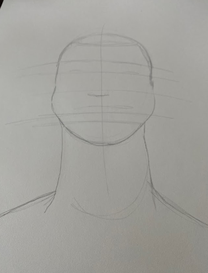
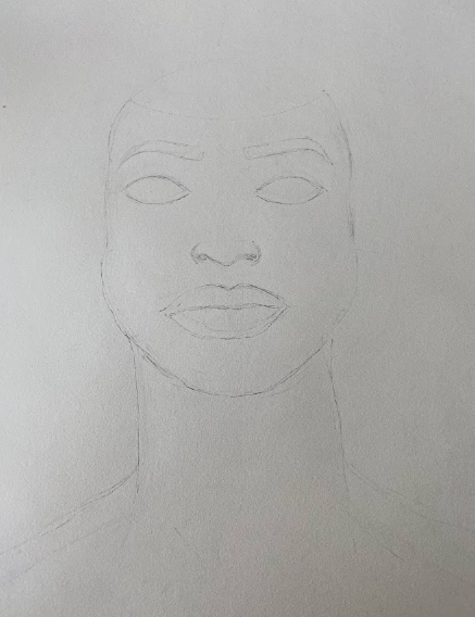
For the final sketch I decided to use lines in order to draw the features on the face. Usually when I draw portraits of people, I will use lines as a reference for where certain features will go, such as the eyes, nose, and mouth. This makes it easier rather than trying to free draw those features because it is in a relatively balanced placement on the face. Looking back at this initial sketch, I realize that his neck is too long, and it looks disproportionate to the size of his head and shoulders. I do change this in the next sketch, however, I should have paid better attention initially when first drawing him out.
|
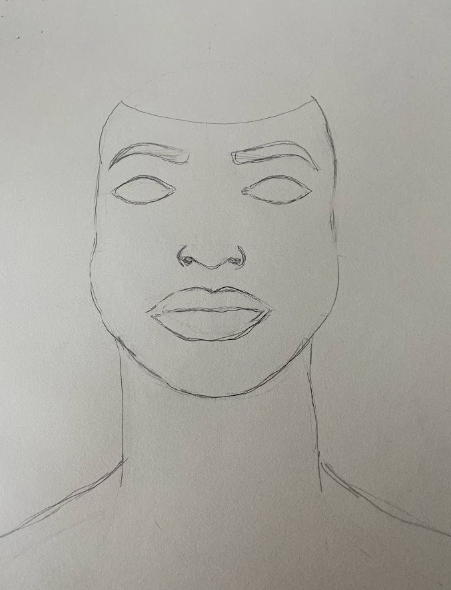
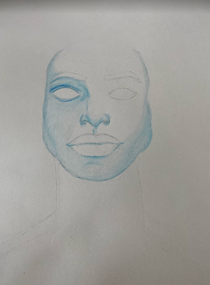
In this sketch, I placed the facial features according to the lines I drew in the first picture. The eyes are slightly unbalanced looking back at this picture. This makes the other features seem off as well, which can be distracting to the viewer when looking at the portrait. His eyebrows were also slightly uneven, because of the eyes, which can throw the whole facial structure of the face off. His cheek (left) in the picture is more rounded compared to the more flat distinct jaw on the right of the face. If I could go back, I would probably work on his facial features and structure more than I had in order for the proportions to be correct.
|
When I draw portraits as an illustration using colored pencil, I like to draw the final sketch or image with dark harsh lines, and then erase them so that they don't show up when I use colored pencil. This ensures that I have a guideline as to where to draw the contours and highlights of the face, without going over the graphite from the pencil. The graphite often can darken the color pencil which can cause it to smudge and look unintentional to the portrait. It also makes it easier to blend with color pencil when the paper has no graphite from the pencil on it, gives it a more clean look.
|
|
|
|
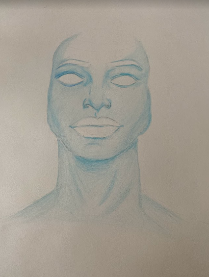
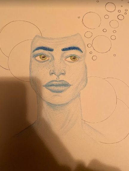
I began shading the face with various blues, consisting of a powder blue, sapphire blue, teal, and cerulean blues. I began working on the left eye and shading in the rest of the face with various contours and highlights. Usually, I like to start with my lightest shade to shade in the entire face, and then work to blend the various blues together to form shadows and highlights on the face. This makes it easier for me to blend the blues together so that it looks coherent and properly colored in, rather than having to color in sections, which sometimes makes unintentional lines on the face that aren't wanted. Coloring this way, just makes it go faster, and is easier for me personally, to blend. I started the eyes with some pink shading on the inner corners of the left and right side of each eye. I then added some light gray to the top of the lids of each eye, to add more depth to the eyes. I then finished shading and coloring the neck, and added some highlights and shadows with some of the darker blue shades in order to complete the portrait.
Experimentation
|
|
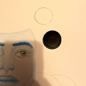
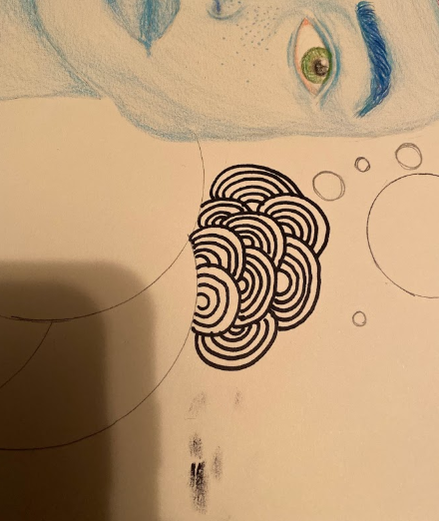
At the time, I didn't have the tools to create perfect circles, so I decided to try and find objects that were circles, both large and small, that I could use in order to create perfect circles. I settled for the vase which had a circular top, which made all of my big circles, and a bottle cap for the smaller circles. It wasn't as good as a tool would have been, some of the circles had ridges because of the bottle cap, and part of the vase was broken so that created a bump. However, I tried my best to create a relatively perfect circle.
|
|
|
|
|
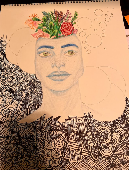
I wanted to keep the portrait and the floral elements in color, and leave the zentangle black and white in order to break up the overall piece. I wanted a balance of both color and simplicity with the black and white. If the portrait of him was black and white with the zentangle, the floral elements would pop more, however, then he would get lost in the piece because there isn't enough of a break between the patterns and the actual portrait. This way, both the portrait, which is a monochromatic color stands out, as well as the flowers and plants, which are very colorful with various greens, reds, purples, and oranges. This allows for the viewer to view the piece and distinguish between the portrait, flowers, and the zentangle in the background. The circles purposes are the same as the portrait and color in the floral aspects, which is to break up the zentangle design. You don't want a piece looking too busy with pattern and detail, so large blocks of solid color or shapes can add some balance to the illustration in order to make sure that your viewer doesn't get lost.
Experimentation
|
I had smudged the sharpie on the paper. This was really frustrating, but something I am used to since I am left handed, and my hand often rubs on canvas or paper, which creates many happy accidents. I decided to throw a pattern over it that would have a lot of thick lines in hopes that it would distract from the smudge. This way the smudge isn't that noticeable and it also fits in with the zentangle design. I often like doing zentangle designs because it is a relatively mindless drawing or pattern technique. If you do happen to make a mistake, it can easily be fixed without being too obvious.
|
|
|
|
|

|
For the background, it was a relatively easy process. I enjoy doing zentangle because it allows you to express your creativity without being too daunting or demanding of a task. Listening to music is a good way to focus and create patterns that come to mind. Some of my patterns do repeat, there are a lot of circular patterns and triangular shapes within the zentangle. Those shapes along with the squares kind of break up the patterns into sections. This makes it easier to draw, especially for particularly larger illustrations like this. Breaking the zentangle down makes the pattern completion process go faster, as well as making it easier to manage the patterns in sections. Overall, I am happy with the turnout of the patterns in the zentangle. I am glad I chose to break it up a bit with the circles and white space within the circles to balance out the detail.
Reflection

|
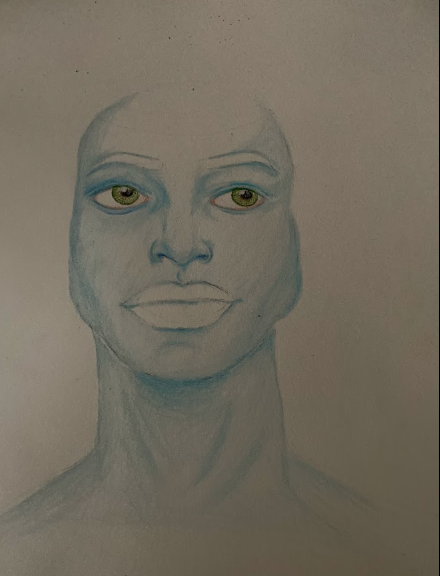
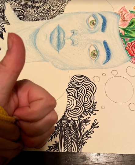
Overall, I am happy with the way the illustration turned out. One thing I would change is the facial features on the face of the man. His eye is a little crooked on the right side in the picture, which then throws off other features like the eyebrows and nose and mouth. This makes the face look kind of off to the viewer, which wasn't my goal, it was something I wanted to avoid. However, thankfully the zentangle can distract from the imperfect qualities of the portrait of the man.
The meaning of this piece is supposed to relate to humans relationships with the earth and the environment, and how connected we become when we are aware of our intertwining relationship with the Earth. But, I initially had the idea in my head of masculinity, and how men usually follow a status quo of a typical strong, ultra-masculine powerful personality, and how it needs to be fixed. It is typical, depending on where and how you grow up in society to be surrounded by these types of ideals and 'molds' that you are supposed to fit into. The flowers coming from the head of the male was supposed to represent that what can be considered 'feminine' (flowers and roses) doesn't have to be feminine. The dark industrial colored circles and pattern would represent the harsh ideals and restriction of what stereotypical masculine traits fall into, and what some males are surrounded with in their life, even though if they have certain thoughts or ideals that they view as wrong (which aren't), they keep in their mind. The opening is supposed to resemble the 'breaking of the mold'. Fighting the stereotypes and finding individuality. However, I wanted to keep the meaning more universal, and allow others to interpret what they will when they view my piece. |
Compare and Contrast
|
Choose Your Own Path, Pedro Tapa, Digital Illustration using Photoshop
Completed August 15th 2016 |
Similarities
Differences
|
|
