Triptych

|
Title : Artist Journey Size : 25.4 x 50.8 cm Medium : Acrylic on Canvas Completion : April 2019 |
Exhibition Text
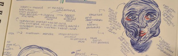
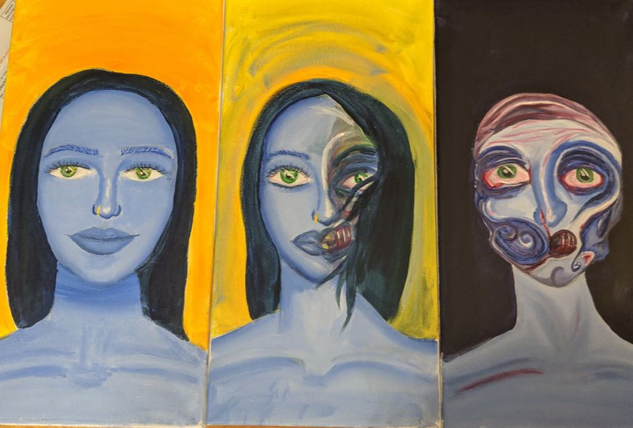
Through the inspiration of Pablo Picasso's "1904 Woman with a helmet of hair'' and Francis Bacon's ''Self Portrait (1969)'', I was able to create my triptych using acrylic paint to represent a story. The piece symbolizes the struggle of mental health that many artists, including my self, deal with.
Inspiration

Pablo Picasso, 1904, Woman with a Helmet of Hair, gouache on tan wood pulp board, 42.7 x 31.3 cm, Art Institute of Chicago
|
I wanted to use Pablo Picasso, specifically a painting from his blue period as one of my inspirations because I liked both the symbolism of the blue monochromatic period he had, as well as the tone and texture of the piece (Women with a Helmet of Hair). Francis Bacon had depicted his subjects in a way that was intriguing and different from other artists. He like to be different and unique in his pieces, often dark in nature. I wanted to transition from the blue period of Picasso, to a more disfigured form like Bacon had painted himself as well as various other subjects of his during his lifetime as an artist. |
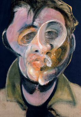
Francis Bacon, Self-Portrait, 1969, Oil on canvas. 14 x 12 in. (35.5 x 30.5 cm).
|
Planning, Meaning, Experimentation
|
|
|
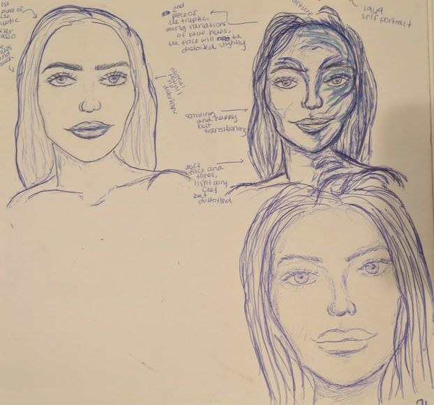
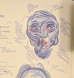
Meaning - The first piece is to symbolize myself, and my creativity and contentment. I feel that many artists like myself have our very own rose and blue periods in our lives, and it can go hand in hand with mental illness. The blue monochromatic scheme is to symbolize the progression into an unhealthy mental state, where your mental illness consumes you and who you are. It can be taken quite literally, as a decline in physical health and appearance, or it can be taken metaphorically, as a decline in mental state and feeling. The second piece symbolizes mid-transition, where you feel overwhelmed and saddened, however you can still manage and cope with yourself and daily life. It is why half of my face is morphing into a more distorted perspective. The third piece is completely distorted because it represents the complete takeover of a mental state or illness. Many creative people often suffer from mental illness or depression, and it can affect not only your life, but your artwork. As an artist, you create what you know and what you feel. Sometimes creating and putting the negative mental state or health on canvas or on paper or in any media, can help take away some of the pain while bringing to life something emotionally charged made with heavy feeling and passion.
Planning - The first piece I wanted to use my regular face, just a simple portrait to represent the first piece of the story. I didn't want to make any distortions, however, I still wanted that gloomy, saddened feeling, and so I added the blue tones as Picasso did, in order to communicate a sense of sorrow and melancholy feel to the first two pieces. The second and third piece, I grew inspiration from Francis Bacon. When I first saw his paintings, I immediately fell in love with the raw and unapologetic distorted and disturbing figures he often portrayed in all of his works. His pieces carried no censorship, just raw emotion. This is something that grew inspiration, especially for the third piece because I wanted that raw uncomfortable appeal to my distorted portrait.
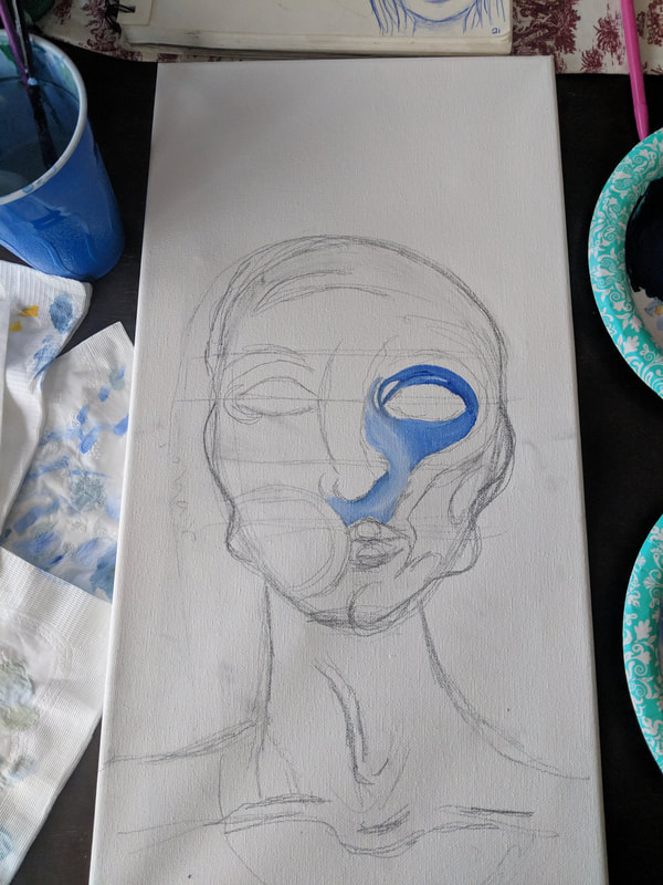
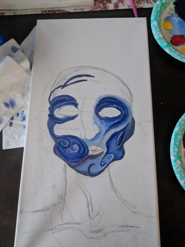
Experimentation - The second piece I had doubted myself and how I wanted to present the piece quite a lot. I wasn't sure if I wanted to try and emulate Bacon's style or create my own twist from inspiration from his various works and artistic style. I had tried creating a similar style to Bacon in the second one, however it didn't work out as well as I hoped and so I had brushed over it essentially to try and buffer it out and create a more abstract appearance. With the third one, I had tried using harsh line work for the shadows and contours of the piece, without any variation, or gradation between the lights and the dark. But, I found that having the gradation made the line work and contours look more prominent and three dimensional, as opposed to a more harsh two dimensional look.
Planning - The first piece I wanted to use my regular face, just a simple portrait to represent the first piece of the story. I didn't want to make any distortions, however, I still wanted that gloomy, saddened feeling, and so I added the blue tones as Picasso did, in order to communicate a sense of sorrow and melancholy feel to the first two pieces. The second and third piece, I grew inspiration from Francis Bacon. When I first saw his paintings, I immediately fell in love with the raw and unapologetic distorted and disturbing figures he often portrayed in all of his works. His pieces carried no censorship, just raw emotion. This is something that grew inspiration, especially for the third piece because I wanted that raw uncomfortable appeal to my distorted portrait.
Experimentation - The second piece I had doubted myself and how I wanted to present the piece quite a lot. I wasn't sure if I wanted to try and emulate Bacon's style or create my own twist from inspiration from his various works and artistic style. I had tried creating a similar style to Bacon in the second one, however it didn't work out as well as I hoped and so I had brushed over it essentially to try and buffer it out and create a more abstract appearance. With the third one, I had tried using harsh line work for the shadows and contours of the piece, without any variation, or gradation between the lights and the dark. But, I found that having the gradation made the line work and contours look more prominent and three dimensional, as opposed to a more harsh two dimensional look.

|

|
Process
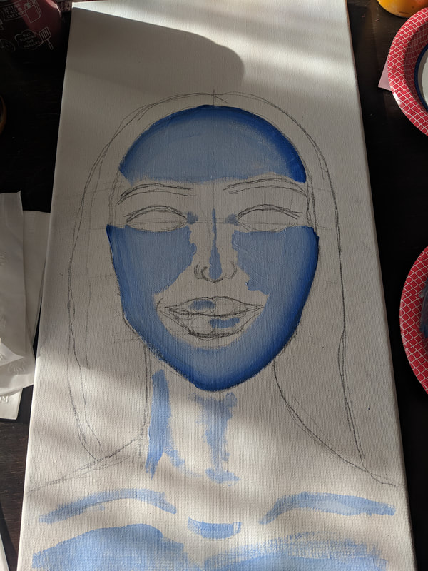
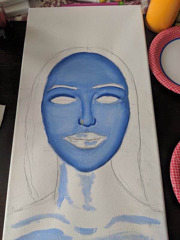
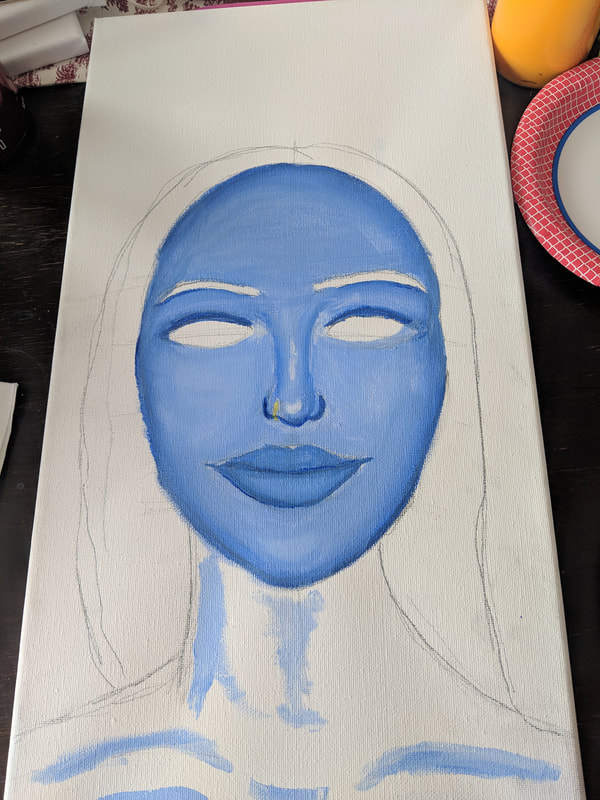
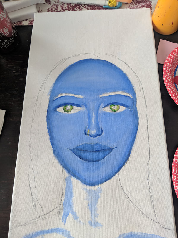
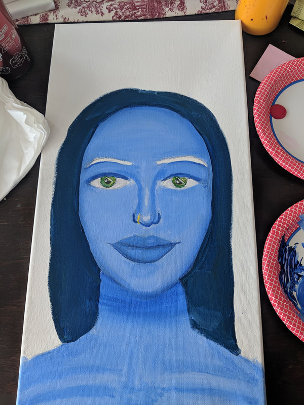
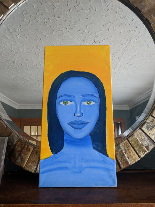
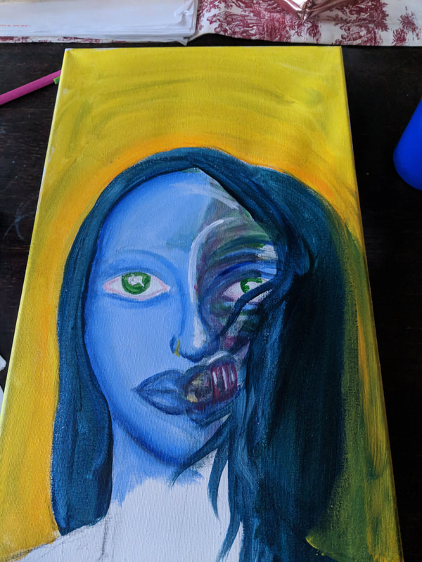
The first piece - I had to use the baroque method a little bit in order to blend out the skin tones and highlights and contours of the face and of the neck and chest. I began with the outer lines of the face and working inward toward the nose and lips. This was it was easier if you had made a mistake to go and fix it later and blend it in with a much lighter highlight color. The nose was difficult to do, with the contours and the highlight. If I could go back and fix anything for the first piece it would be the nose because it looks disproportionate to the face, as well as the eyes too. I added the yellow background to contrast the blue melancholy in order to more effectively communicate my idea.
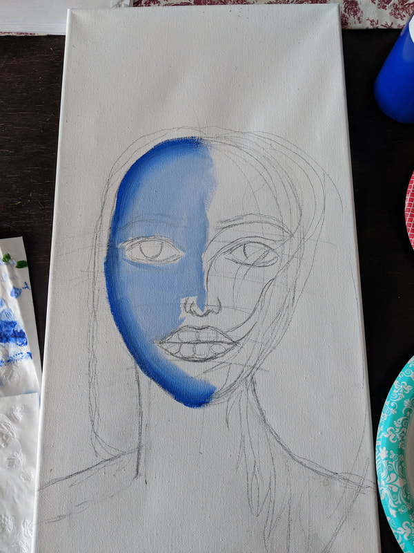
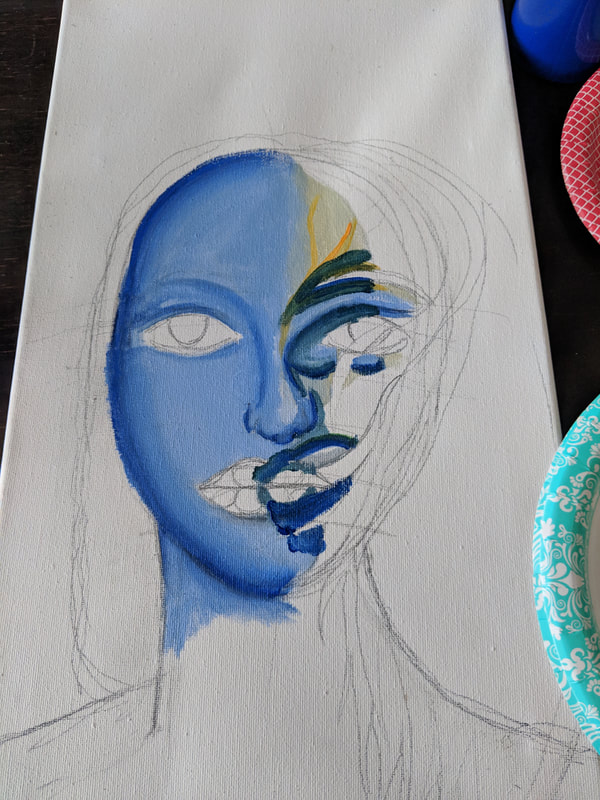
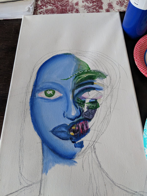
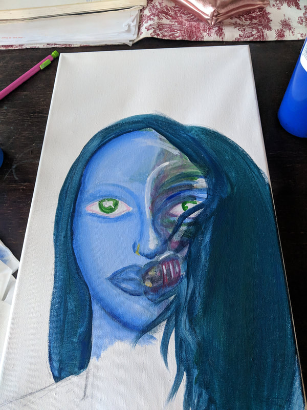
For my second piece, - I had used a bit of the baroque blending method for the blue skin. I then did half of the face with inspiration from Bacon and all of his portraits he created with distorted faces. When I had first done the half of the distorted face, it was more detailed and blended than how it is in the final one. I wanted to attempt to stay true to Bacon's somewhat abstract style, and so, I blurred some of my more defined lines and muted some colors in order to better present his stylistic choices. If I could change anything to this piece it would most likely be the distorted part because I am still not content with the way it looks. I made the eyes bigger on this one purposefully because in the final one, the face would be completely distorted and disproportionate. Leaving the eyes disproportionate in the second one to transition into the third one only made more sense. It would allow the three pieces to flow more consecutively and work together to form a story.
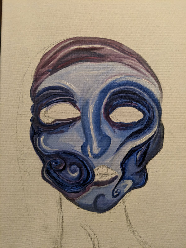
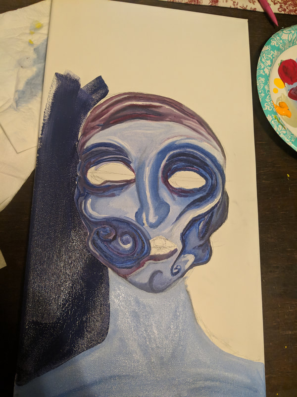
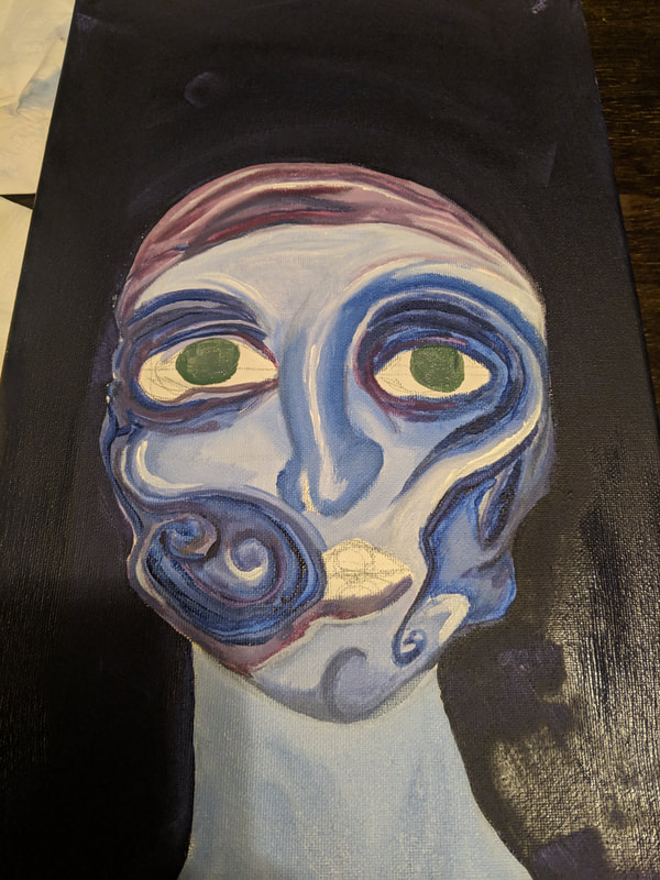
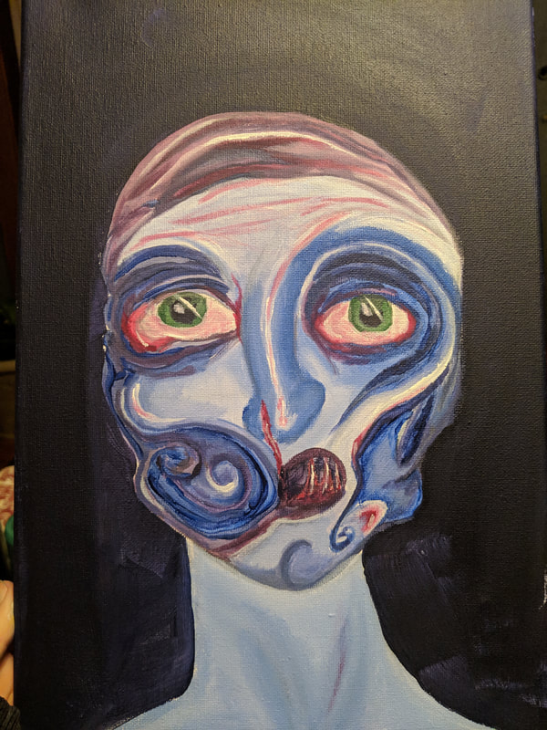
The final third piece - With this piece, I wanted to make it my own interpretation of Bacon and still emulate some of his prominent artistic choices while also using my own artistic choices in order to create one cohesive piece. Often, Bacon will distort the nose so that it is curved to the right, and almost always, there is a highlight on the nose and various other parts of the face. All of his faces have very geometric, Picasso like qualities of the cubism area, with various shapes in the facial figure. I wanted to exaggerate those stylistic choices and bring out his emphasized features from his portraits. However, I did decide to stick with blending out some of the blue tones and colors because it looked more clean and three dimensional than if I were to blur and dull the color. Overall, I think they are interesting pieces that allow the audience to interpret whatever story they please.
Compare and Contrast
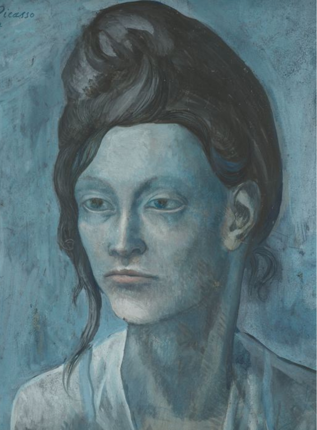
Pablo Picasso, 1904, Woman with a Helmet of Hair, gouache on tan wood pulp board, 42.7 x 31.3 cm, Art Institute of Chicago

Francis Bacon, Self-Portrait, 1969, Oil on canvas. 14 x 12 in. (35.5 x 30.5 cm).
|
Similarities
Differences
|

|
Reflection
|
Overall, I think this project was successful in telling a meaningful story represented through myself as the subject and of the distinct mental health situations and issues all artists face, and all people face at some point in their lives. I felt that mental health was an important topic, and using two artists that struggled with some mental health issues allowed me to create a stronger connection and cohesiveness to the three pieces. If I were to go back and change anything again, it would be the second one completely, as well as fix some of the backgrounds and patches in the first and third piece. However, I think it is a well done piece and effectively can get its message across to the audience in a clear form of interpretation.
|
